
KAM CHANCELLOR'S BAMMARITAS:
PACKAGING THAT HITS HARDER
PACKAGING THAT HITS HARDER
Client: San Juan Seltzer
My Role: All of it.
Scope: Visual identity, packaging design, retail mockups, POS materials, launch support.
Brief: Create a visual identity for a canned margarita that’s lower in calories, high in flavor, and absolutely not trying to look like every other spiked juice box in the fridge.
My Role: All of it.
Scope: Visual identity, packaging design, retail mockups, POS materials, launch support.
Brief: Create a visual identity for a canned margarita that’s lower in calories, high in flavor, and absolutely not trying to look like every other spiked juice box in the fridge.
WHAT'S A BAMMARITA?
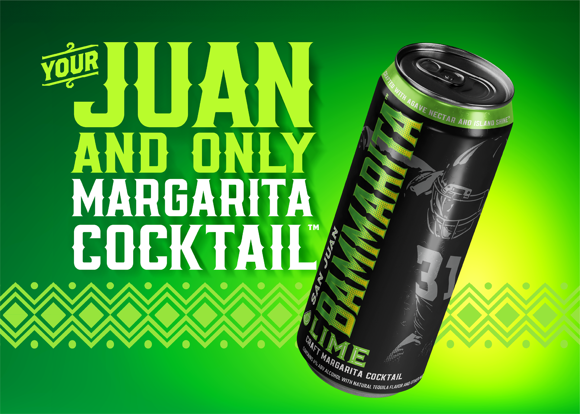
It’s a ready-to-drink margarita with real citrus, zero sugar, a low-calorie label that actually means something, and enough flavor to cancel your other plans. Bammarita had the goods—it just needed the look. Created in collaboration with NFL champion Kam Chancellor, Bammarita needed a design that could balance clean ingredients, philanthropic cred (hi, CHARITY:WATER), and Super Bowl energy. So I built a bold, modern, can-first brand system designed to pop on shelves, stand up to competitors, and hold its own next to the glassware.


THE BRIEF
We partnered with NFL Champion Kam Chancellor to launch the Bammarita: a better-for-you canned margarita with bold Pacific Northwest flavor, premium positioning, and a philanthropic mission. My task was to translate that into a visual identity that could punch above its weight—and turn heads on crowded shelves.
THE APPROACH
I led the brand concept, identity, and packaging design from the ground up, balancing: • • Premium cues with approachable freshness
• A margarita-first color story (lime green, gold, deep black)
• Athletic edge tied to Kam Chancellor’s personal brand
• Space to highlight CHARITY:WATER partnership and clean ingredient story
• A margarita-first color story (lime green, gold, deep black)
• Athletic edge tied to Kam Chancellor’s personal brand
• Space to highlight CHARITY:WATER partnership and clean ingredient story


No tropical clichés. No loud gradients. No sugar-rush rainbow palettes. Instead, I built a bold, elevated system that says:
“This is a real margarita cocktail, not lime-flavored regret”
“I choose my cocktails and my causes carefully.”
“Yes, it’s a canned drink. And yes, it’s cooler than yours.”
KEY DESIGN INGREDIENTS
• Agave-inspired green + citrus contrast
• Clean modern type (with just a hint of flex)
• Bright accents, because taste and performance deserve shine
• Layout built for quick read, faster grab, instant fridge envy


HOW'D IT DO?
Let’s just say the packaging worked. Fast.
• $500K+ in preorders before the first can even shipped
• Picked up by Kroger, QFC, Albertsons, Safeway, and Target
• Poured on draft in PNW bars (because people wanted it in a glass too)
• Part of a portfolio that helped San Juan hit +27% year-over-year growth
• Contributed to profitability in 2024 (yeah, in a category where most brands lost steam)

WHAT I DELIVERED
Everything from “napkin sketch” to shelf-ready.
• Brand & visual identity
• Product label + secondary packaging (12-packs, trays, etc.)
• POS materials
• Retail mockups & sell sheets
• Digital campaign graphics & social content assets
• Print-ready mechanicals for vendors (aka no last-minute file panic)
• Brand & visual identity
• Product label + secondary packaging (12-packs, trays, etc.)
• POS materials
• Retail mockups & sell sheets
• Digital campaign graphics & social content assets
• Print-ready mechanicals for vendors (aka no last-minute file panic)


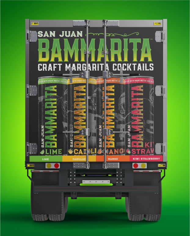
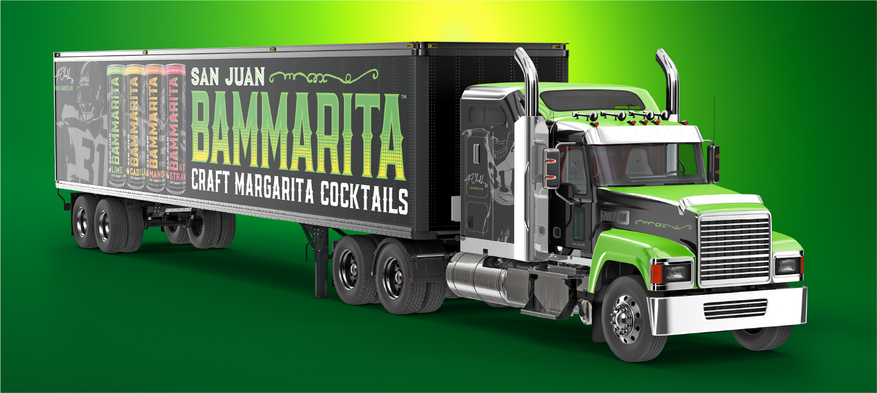
Bammarita didn’t just look good—it sold out, stood out, and made moves. The brand system was built to flex across flavors, formats, and platforms, and it did exactly what great packaging should do: make people pick it up before they even know what’s inside.
Whether you're launching a beverage or a business, I’ll make sure the outside looks as good as what’s inside—and that it sells like it should.
Agency-level design. One-man operation. Let’s go.
FerreiraCreative.com 206.390.1221
FerreiraCreative.com 206.390.1221