Case study · Food & Beverage
Doubles
Brand identity, packaging and launch campaign for San Juan Seltzer's first high ABV line.
The problem
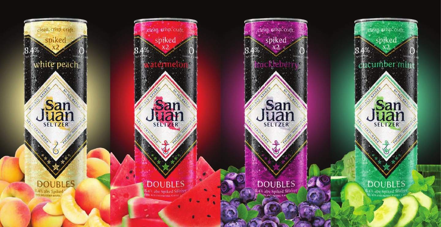
San Juan's first high ABV line needed its own identity without breaking from the parent brand.
The insight
Kroger and Albertsons shaped the line, so the design had to land with buyers before it reached a shopper.
Design intent
One diamond lockup and one type hierarchy on every can, with flavor color doing the sorting. Structure first, so new flavors drop in.
The outcome
$500K+ in retailer preorders before the first can was packaged. Four flavors became eight with no redesign.
Where it started
From a rough mark to the Northwest's craft seltzer.
I came on just before San Juan Seltzer's official launch. The brand arrived with an awkward diamond logo carrying too much type. I rebuilt it into the lockup that now runs across the core line, Doubles and Bammarita. San Juan went on to call itself the #1 craft seltzer in the Northwest, sold in six states.
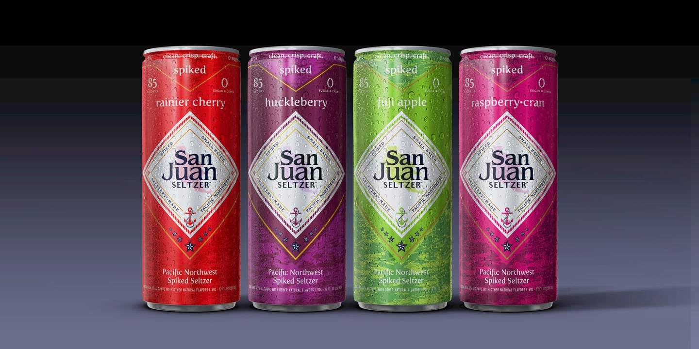
The core line, built on the rebuilt diamond lockup.
The brief
Its own identity, still part of the family.
Doubles was San Juan Seltzer's first high ABV line, at 8.4%. It needed its own identity without breaking from the parent brand. Kroger and Albertsons/Safeway helped shape the flavors, format and ABV, so the design had to land with buyers before it ever reached a shelf.
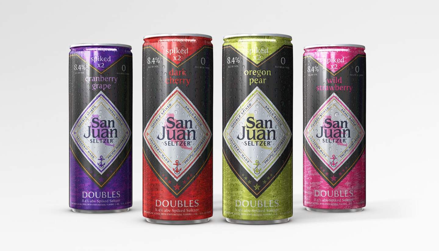
One diamond lockup and one type hierarchy on every can. Flavor color does the sorting.
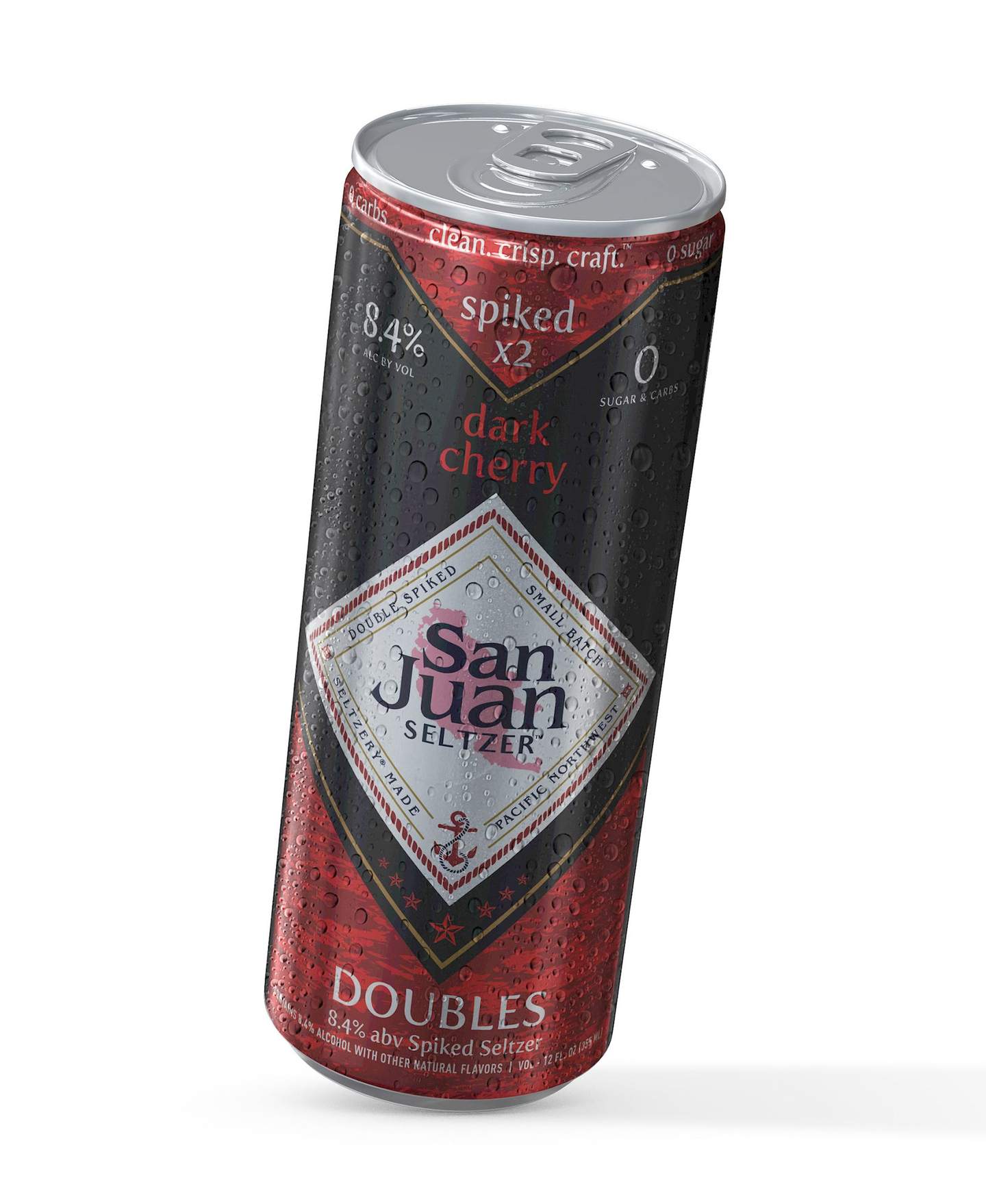
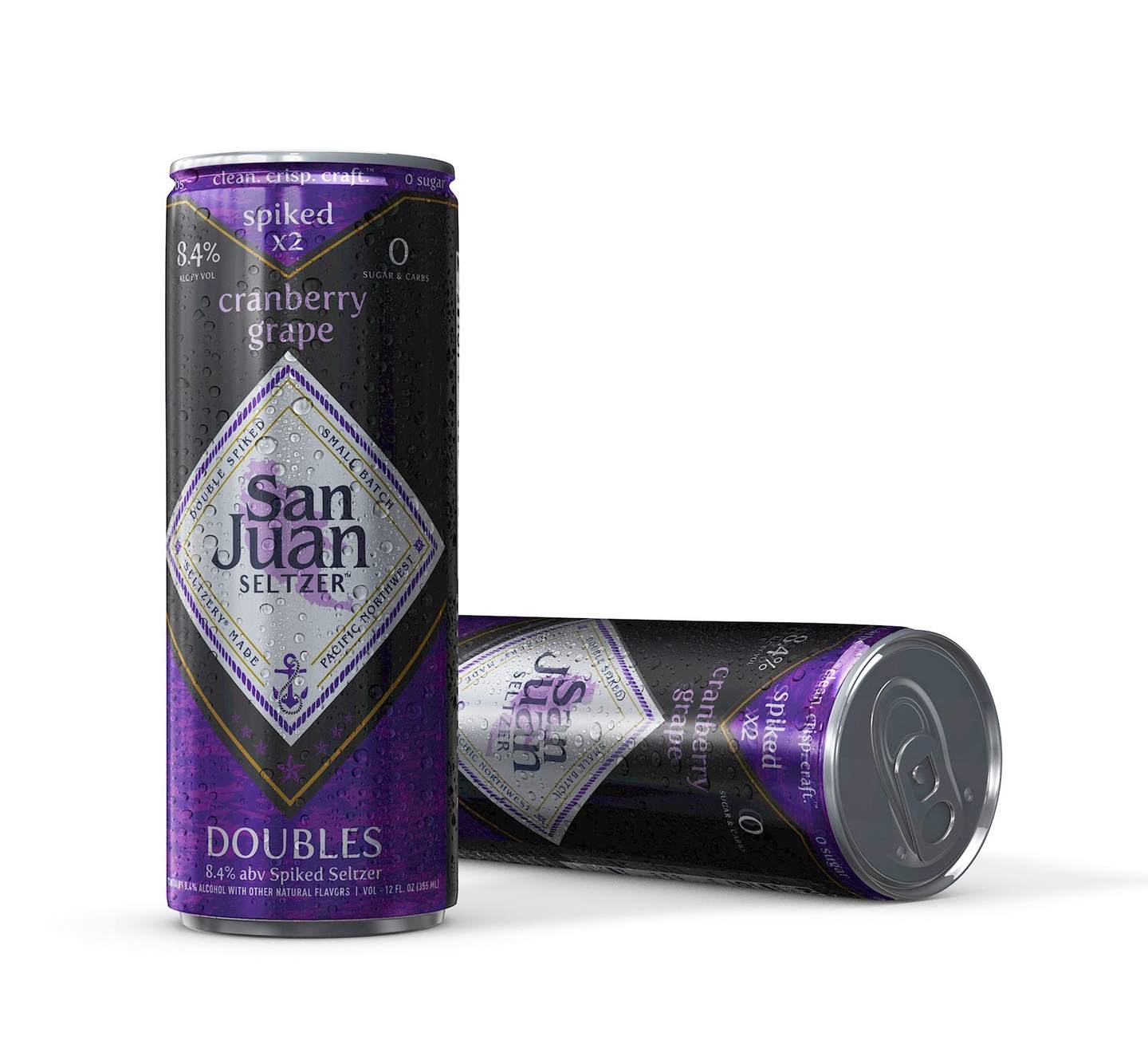
Dark Cherry and Cranberry Grape.
The approach
Structure first.
I set the structure first. One diamond lockup, one type hierarchy and one layout framework on every can, with a bold flavor color doing the sorting. With the rules fixed early, new flavors, cartons and campaign pieces rolled out fast with no redesign.

Demand brought a second wave of four flavors within months of launch. Same system, new colors, no redesign.
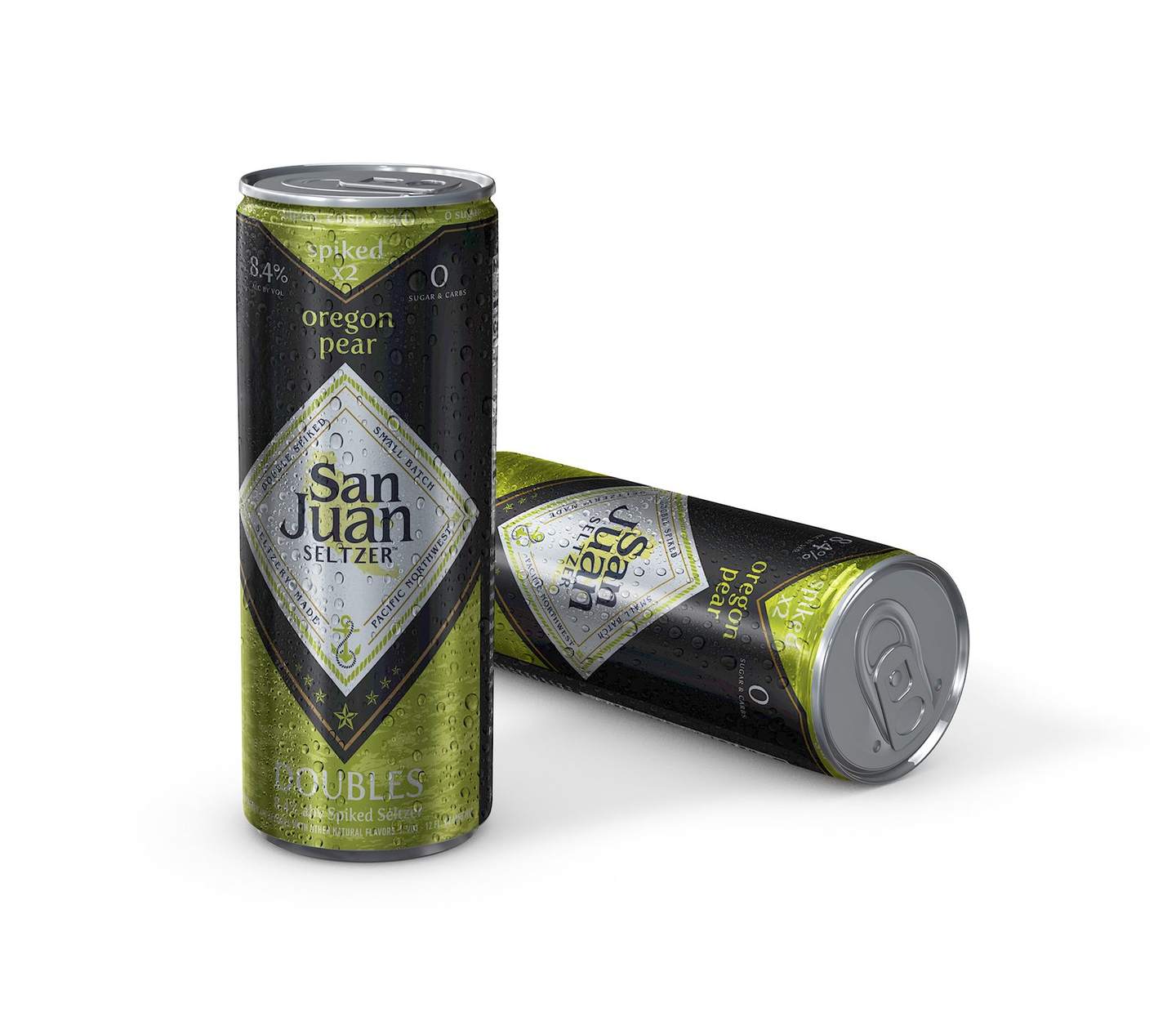
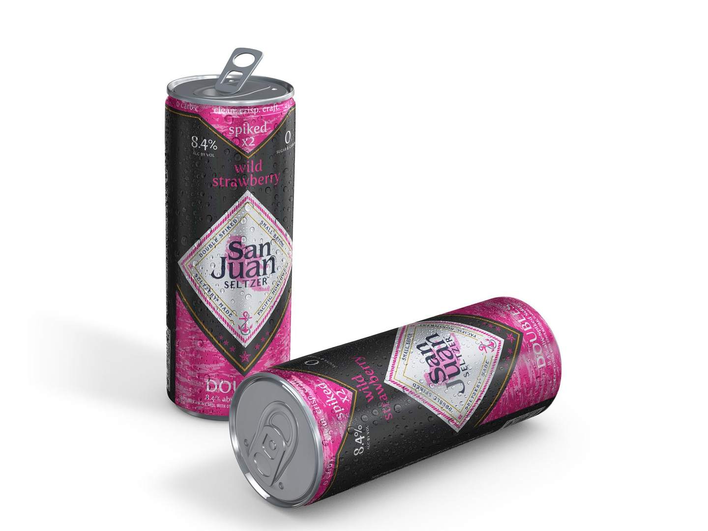
Oregon Pear and Wild Strawberry.
Variety packs
Built to grow.
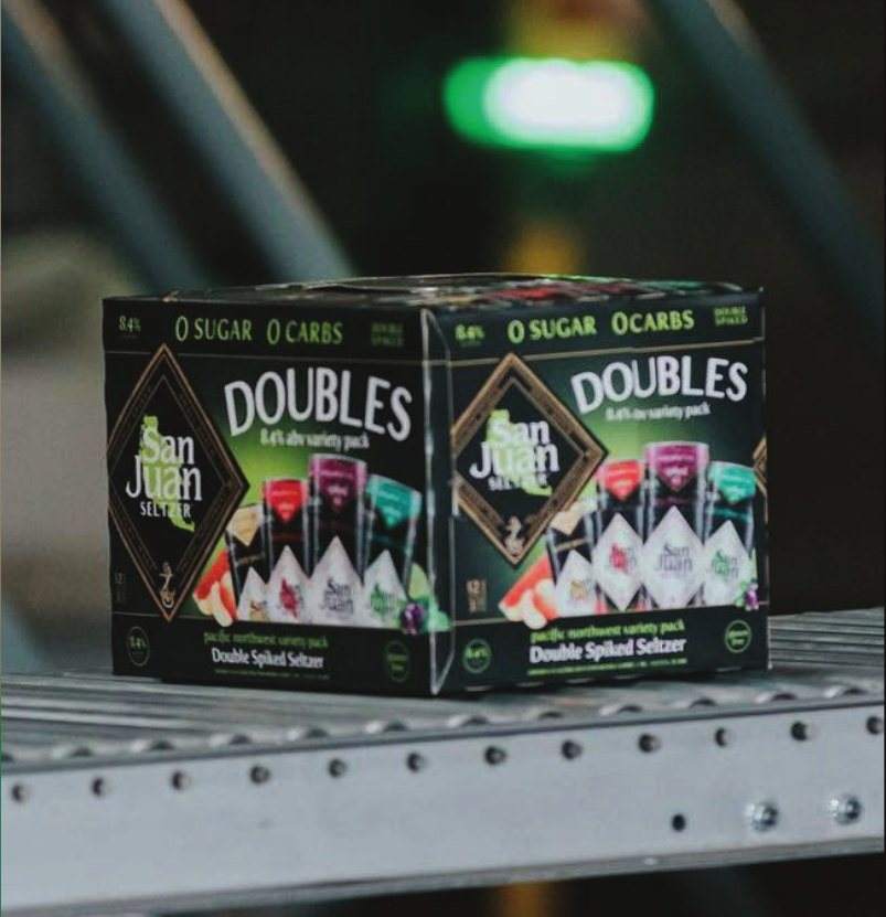
Four flavors had to read clearly, the 12 pack had to work from day one, and the system had to leave room to grow. Each pack takes its color from its flavor set while the lockup stays fixed.
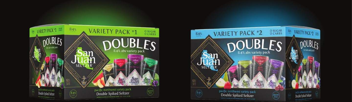
Variety Pack #1 and #2.
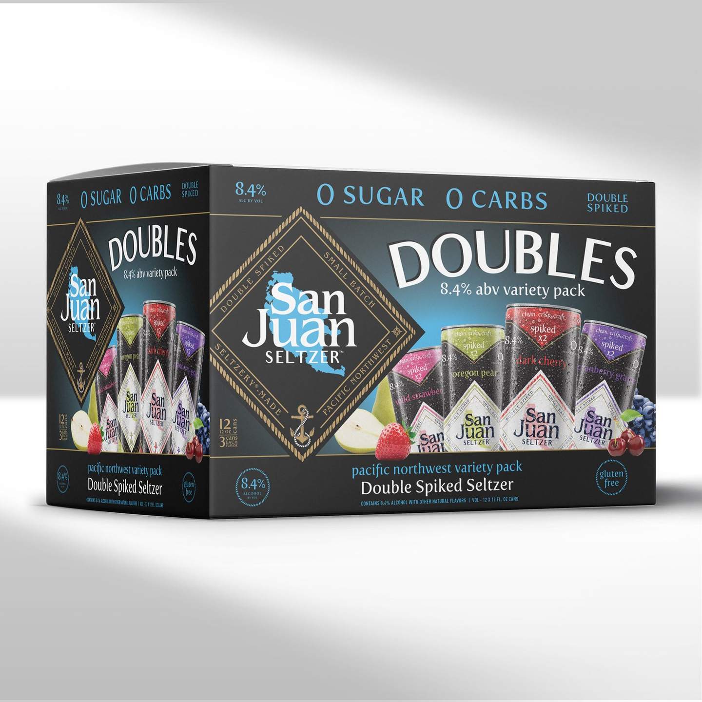
Variety Pack #2, 12 can carton.
Production
Built for press.
I owned the production side. Press sheets with spot color breakdowns, carton dielines for the 12 can case, and proof reviews with the printer on every SKU.
- Spot color breakdowns on every can
- Carton dielines for the 12 can case
- Proof reviews with the printer on every SKU
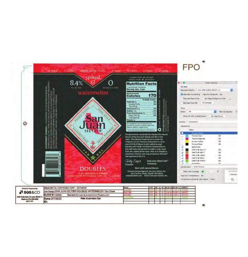
12 oz slim can press sheet and color breakdown.
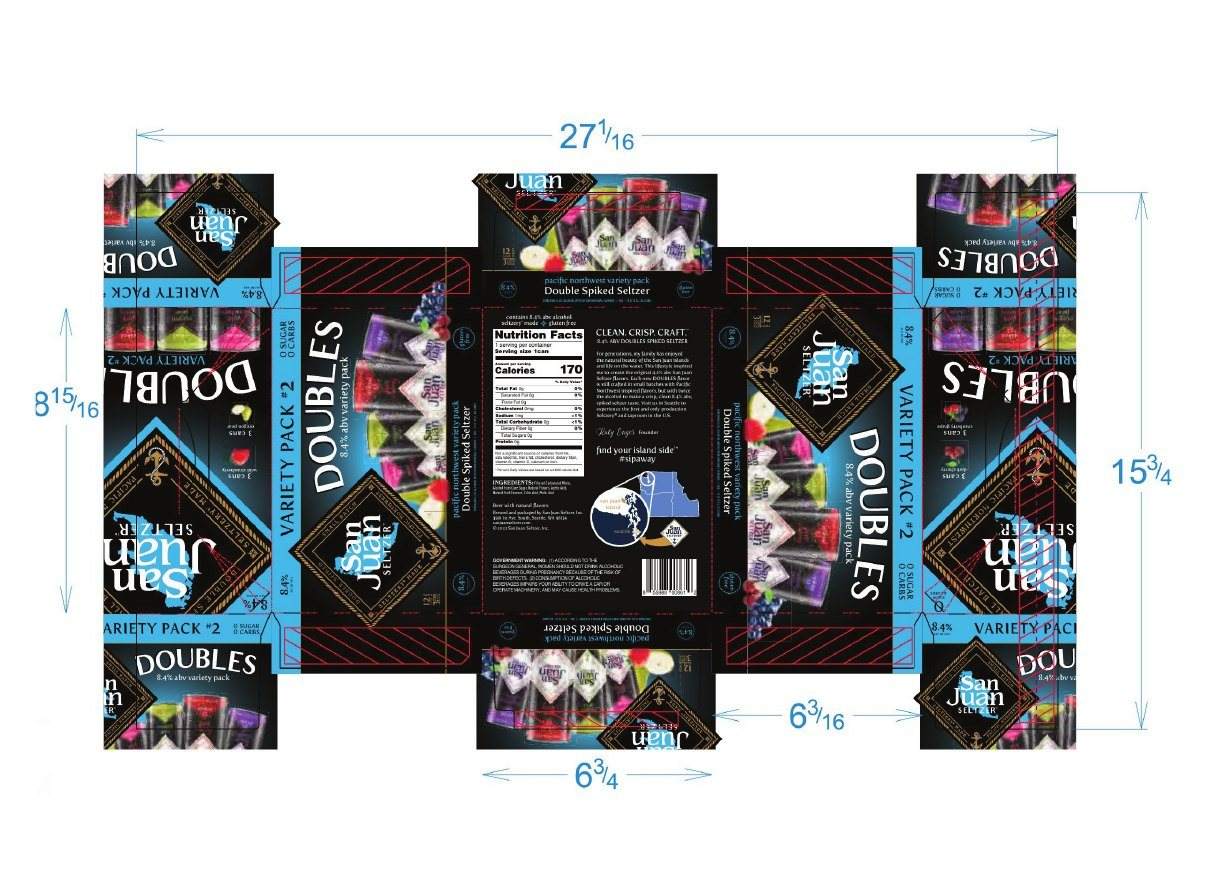
12 oz slim can case dieline, Variety Pack #2.
Launch campaign
Seeing Double?
A social and paid campaign built on the double vision idea, launched May 1, 2023 on Instagram and digital display. The same look carried into in store POP and branded apparel.
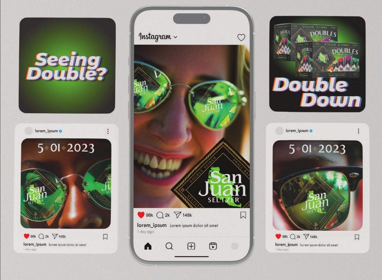
Social launch on Instagram and digital display.
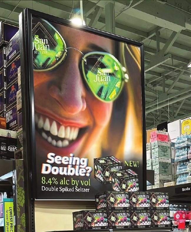
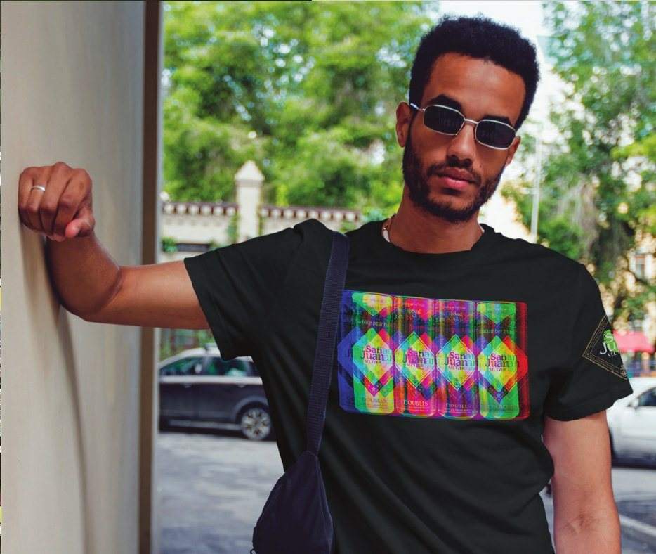
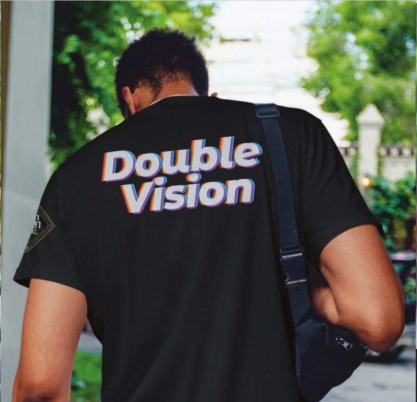
In store POP and Double Vision apparel.
Launch video
From storyboard to final cut.
I carried the identity all the way into the launch spot. Storyboards, visual direction and the final edit, built to run with the packaging, POS and social rollout.
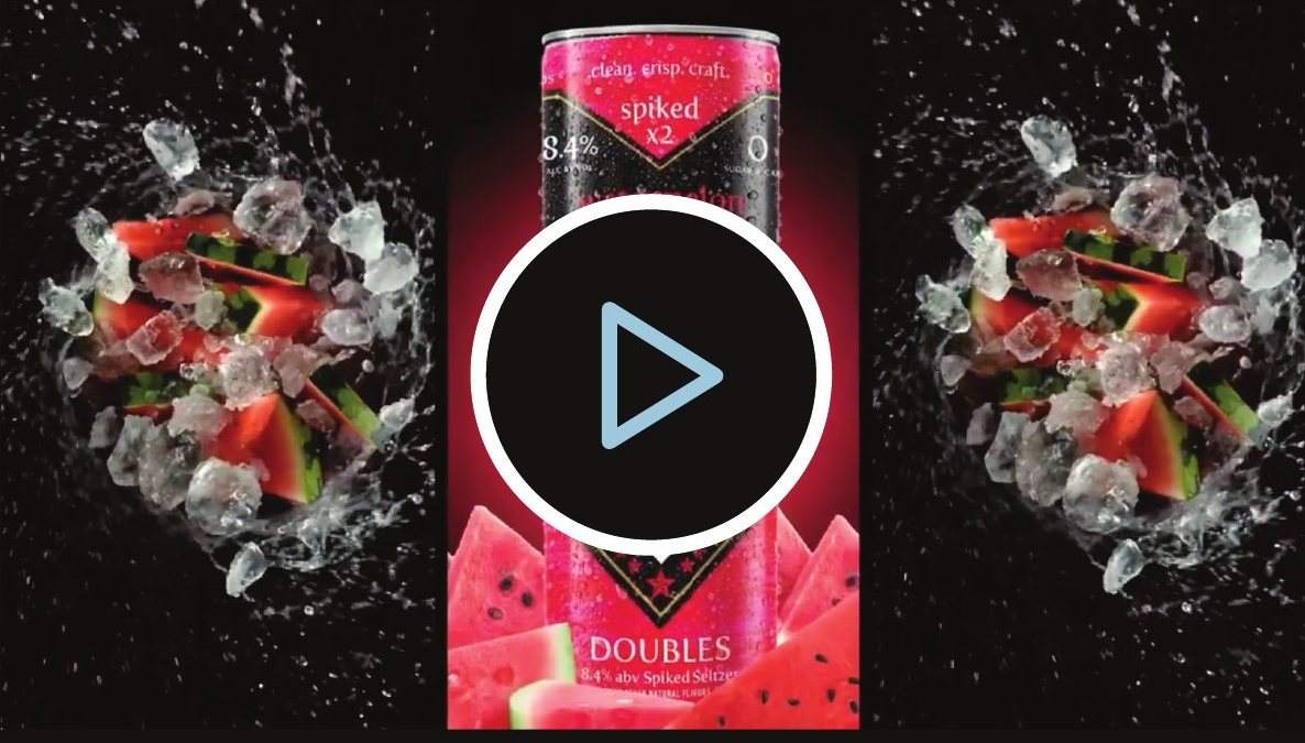
The launch spot. Press play.
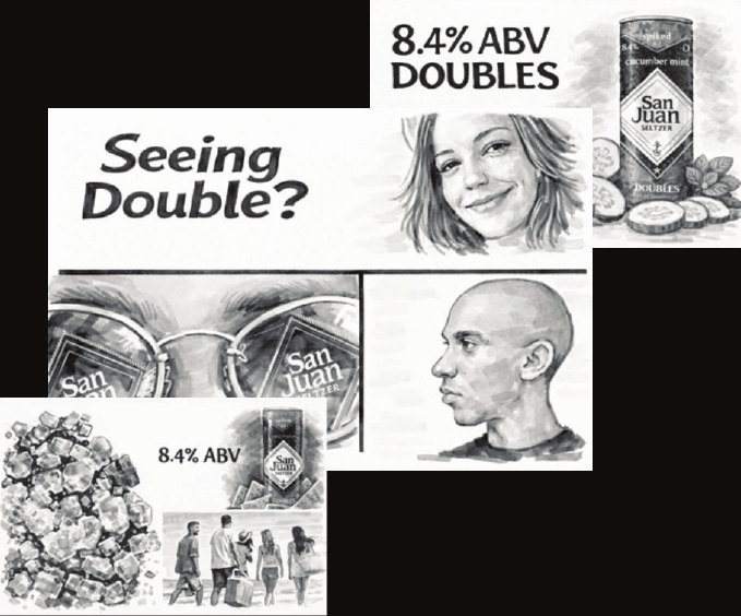
Storyboard frames for the launch spot.
Launch day
Meeting the people.
The launch put the product in people's hands. An oversized inflatable can, a floor to ceiling wall of cases, staff in branded shirts and a crowd that came on purpose.

Launch day.
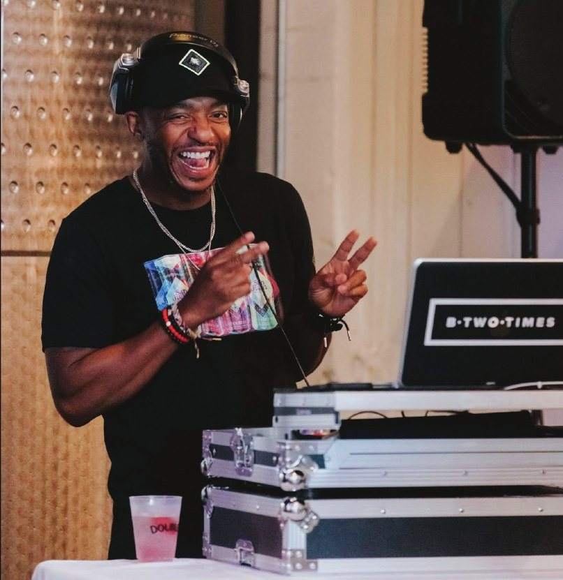
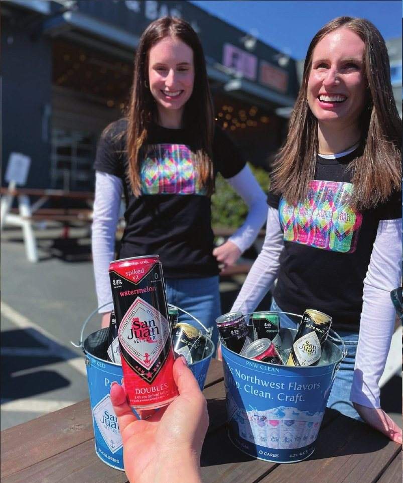
Staff and crowd in Double Vision shirts.
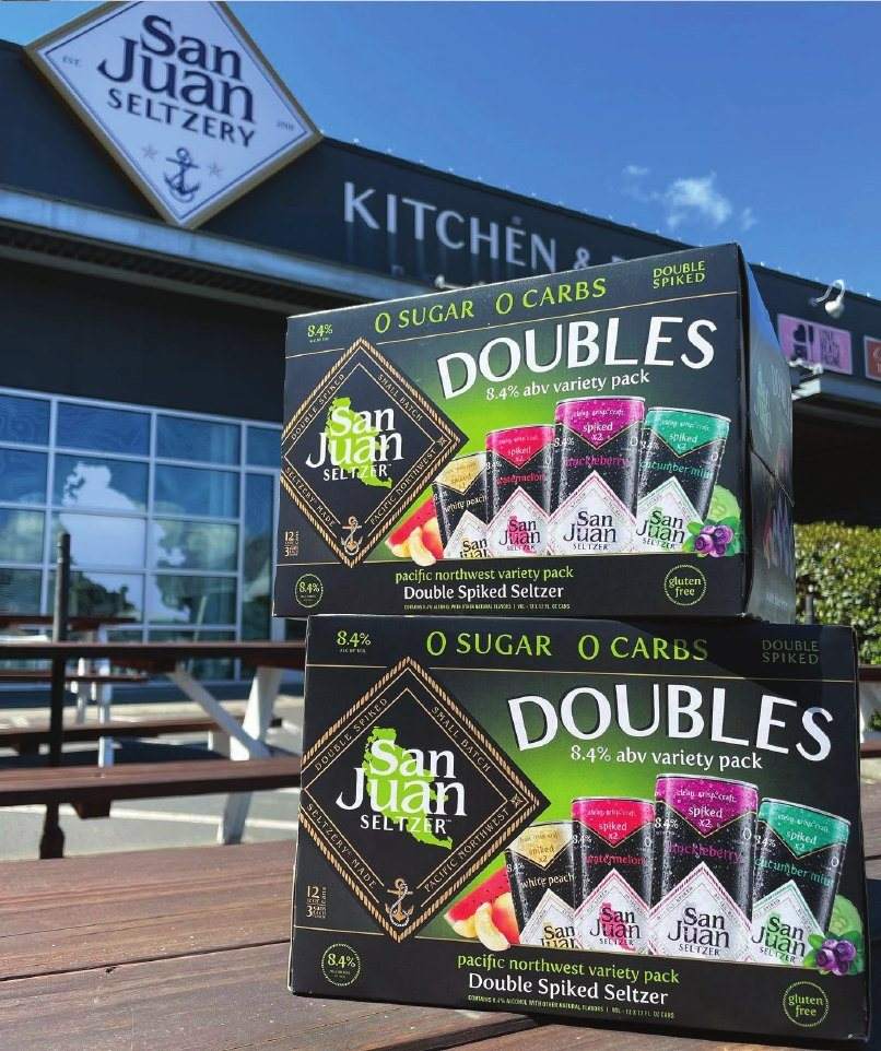
At the San Juan Seltzery.
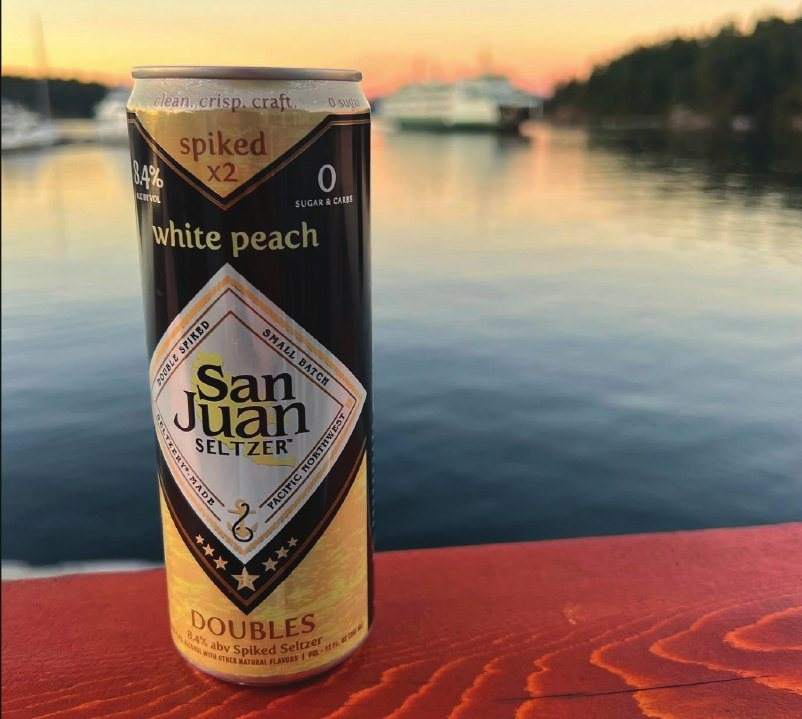
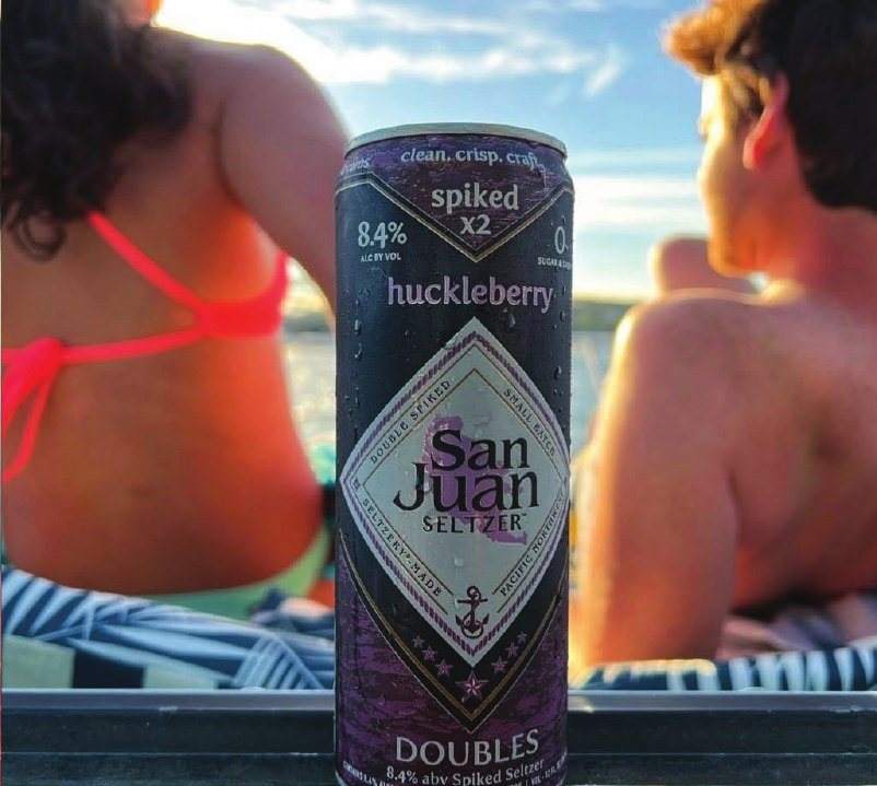
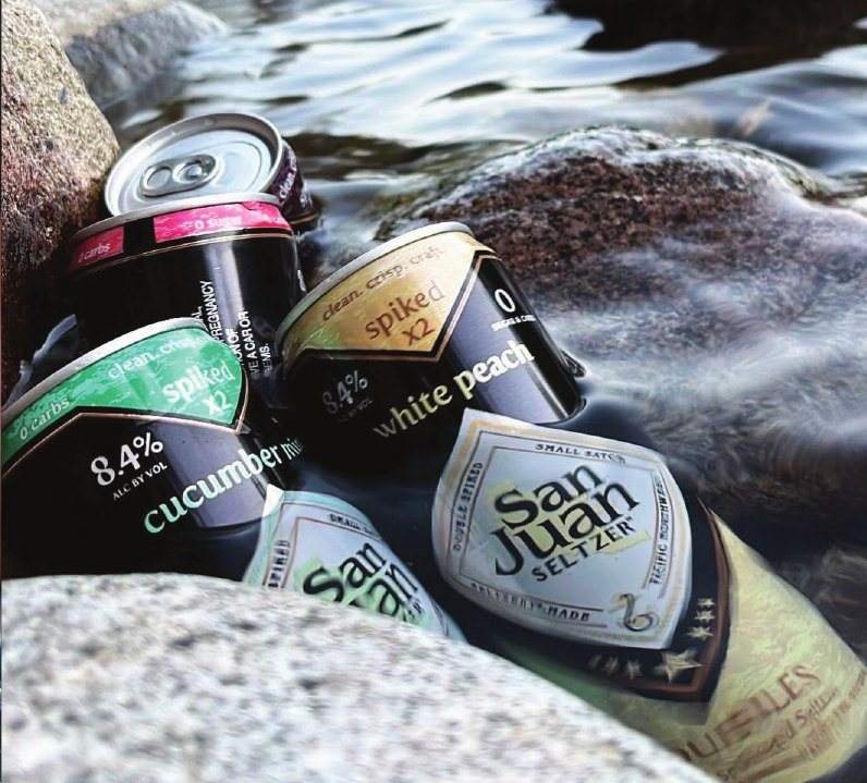
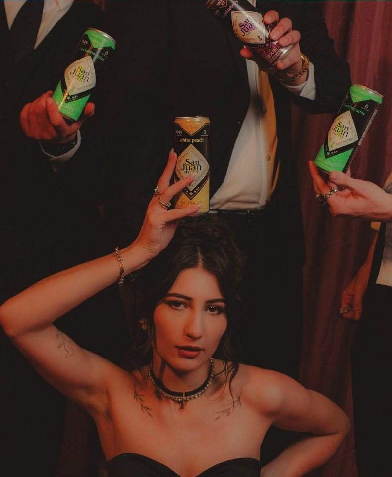
Product in the wild. Lifestyle photography for social and retail.
The outcome
Sold before it was packaged
$500K+
in retailer preorders before the first can was packaged
2×
the ABV of San Juan's core seltzers. 8.4% against 4.2%, a new category for the brand
4 → 8
flavors within months of launch, with no change to the system
Backed by a $500K+ launch campaign. H-E-B asked to carry it year round instead of seasonally.
Sources · Brewbound · Washington Beer Blog
More than a service provider, Anthony has been a trusted extension of our team, and our one stop creative resource.
Launching a beverage?
One senior designer from first sketch to press,
on retainer or by the project.