
Case study · Food & Beverage
Top Pot Doughnuts
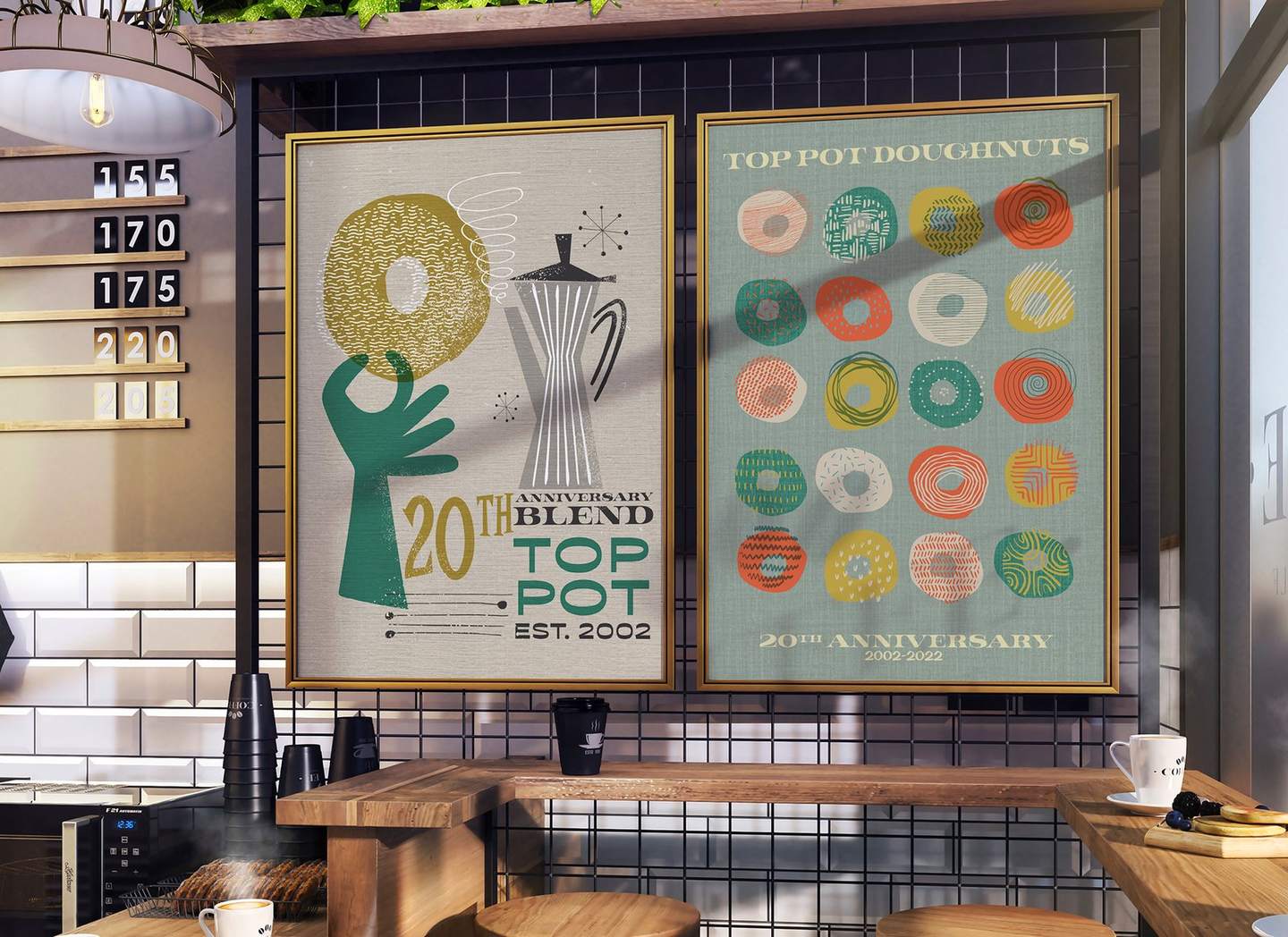
Illustration, posters and tees for Top Pot's 20th anniversary, plus a concept coffee bag system.
The problem
The 20th anniversary needed posters and tees as mid century as the cafes.
The insight
Characters carry a brand further than a logo can.
Design intent
A cast of nine retro characters in flat color and expressive line, built to work alone on any surface.
The outcome
Posters and tees produced. The coffee bag system is shown as concept.
The brief
Twenty years, drawn mid century.
Mark and Michael Klebeck opened Top Pot on Capitol Hill, and it now runs 17 cafes around Puget Sound and roasts its own coffee. For the 20th anniversary, Top Pot wanted posters and tees that felt as mid century as its cafes.
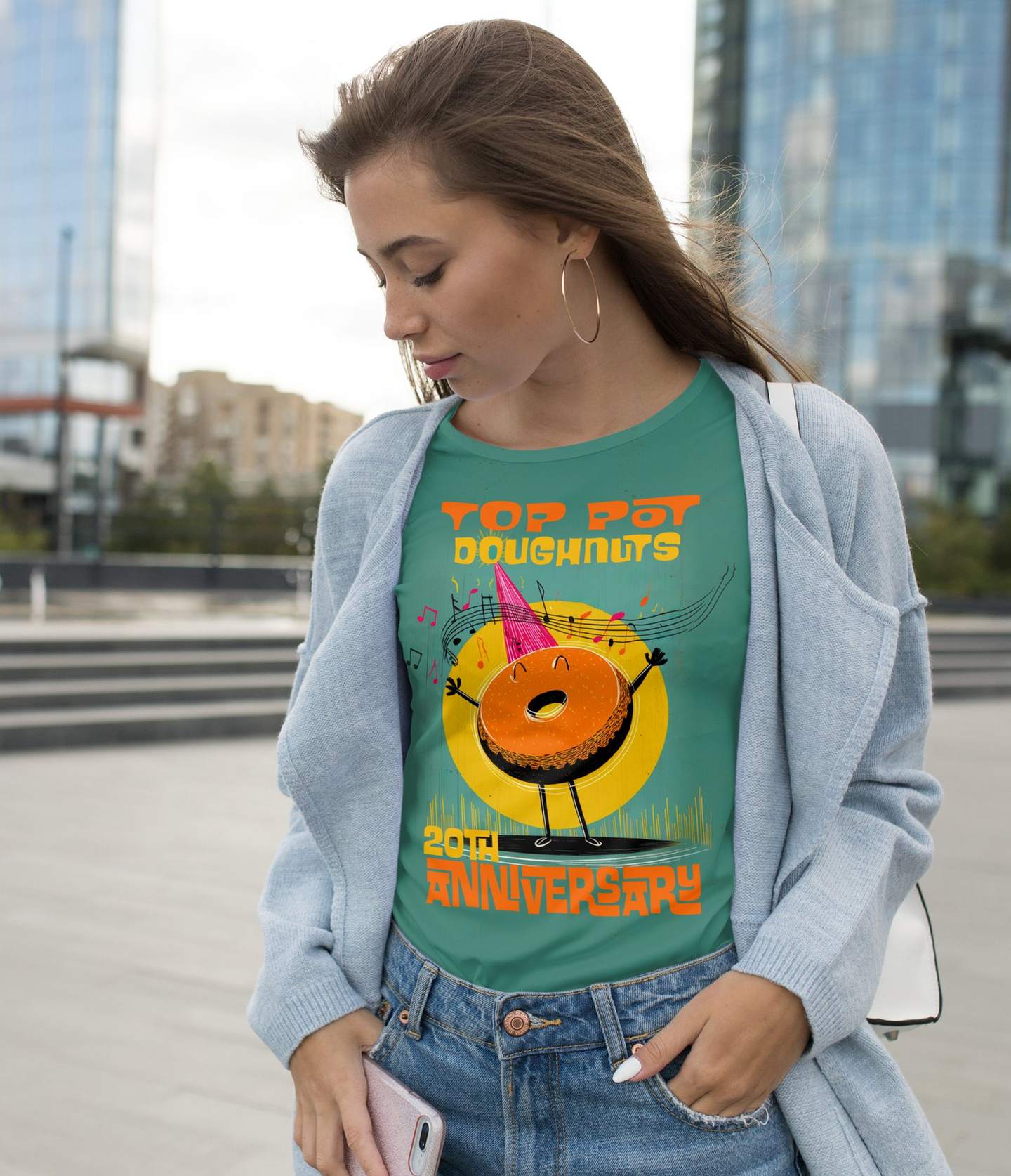
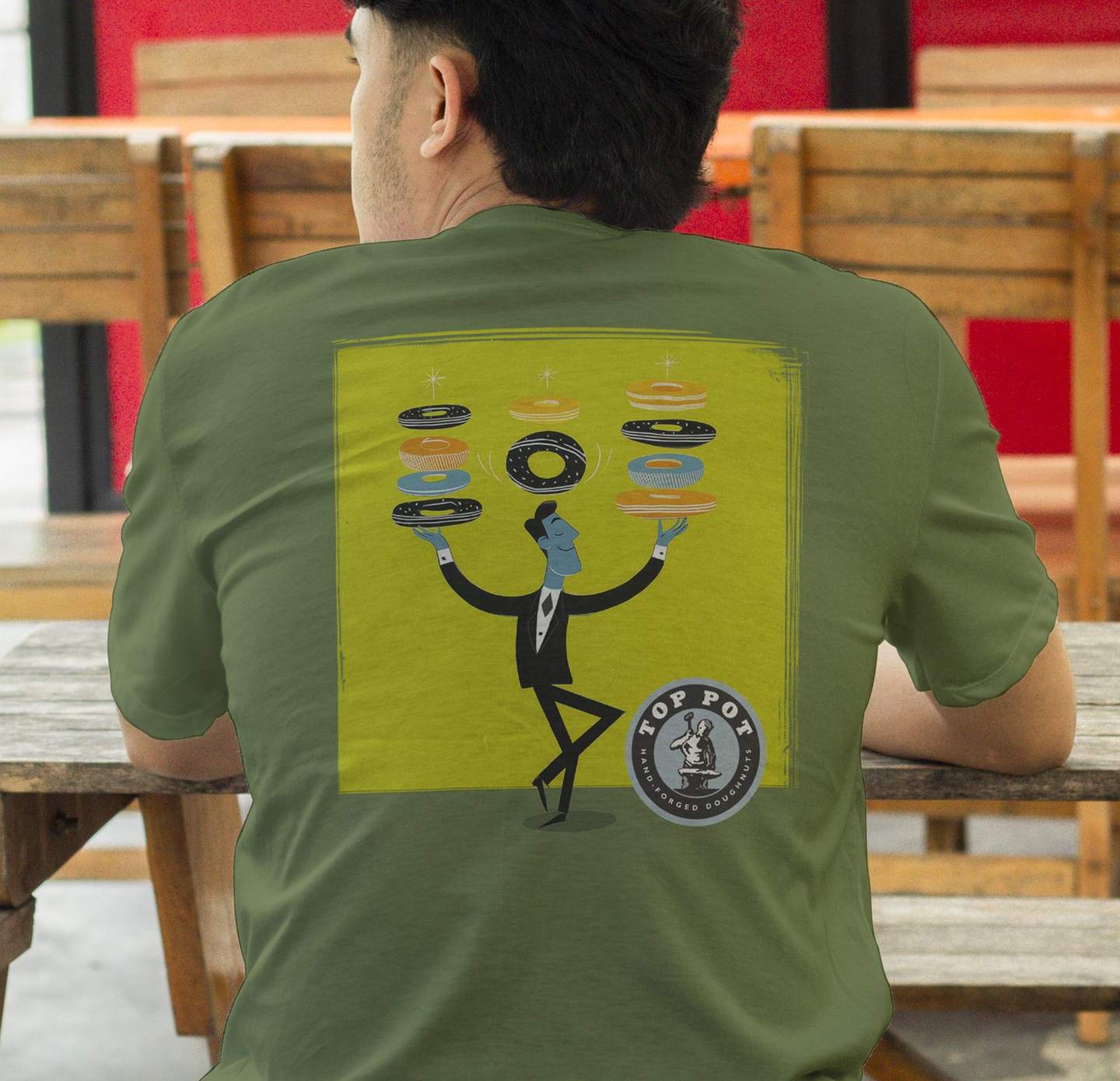
Anniversary tees with screen print ready files.
The cast
Nine original characters.
I drew a cast of nine retro characters to match Top Pot's interiors, from the juggler to the espresso stacker. Flat color, expressive line and a bold palette, built to live on its own on a poster, a bag or a shirt.
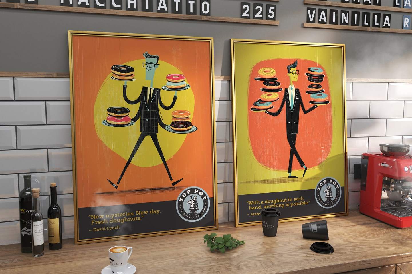
The juggler and the doughnut man.
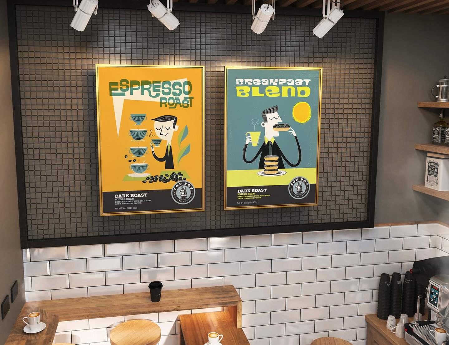
In cafe posters.
The coffee concept
One character per roast.
Top Pot's coffee still ships with a generic house sticker. As a self initiated concept, I gave each roast its own character, so the bag sells the coffee the way the cafes sell the doughnuts. This part is concept work and hasn't been produced.
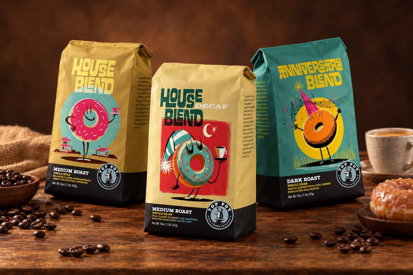
House Blend, House Decaf and Anniversary Blend. Concept.
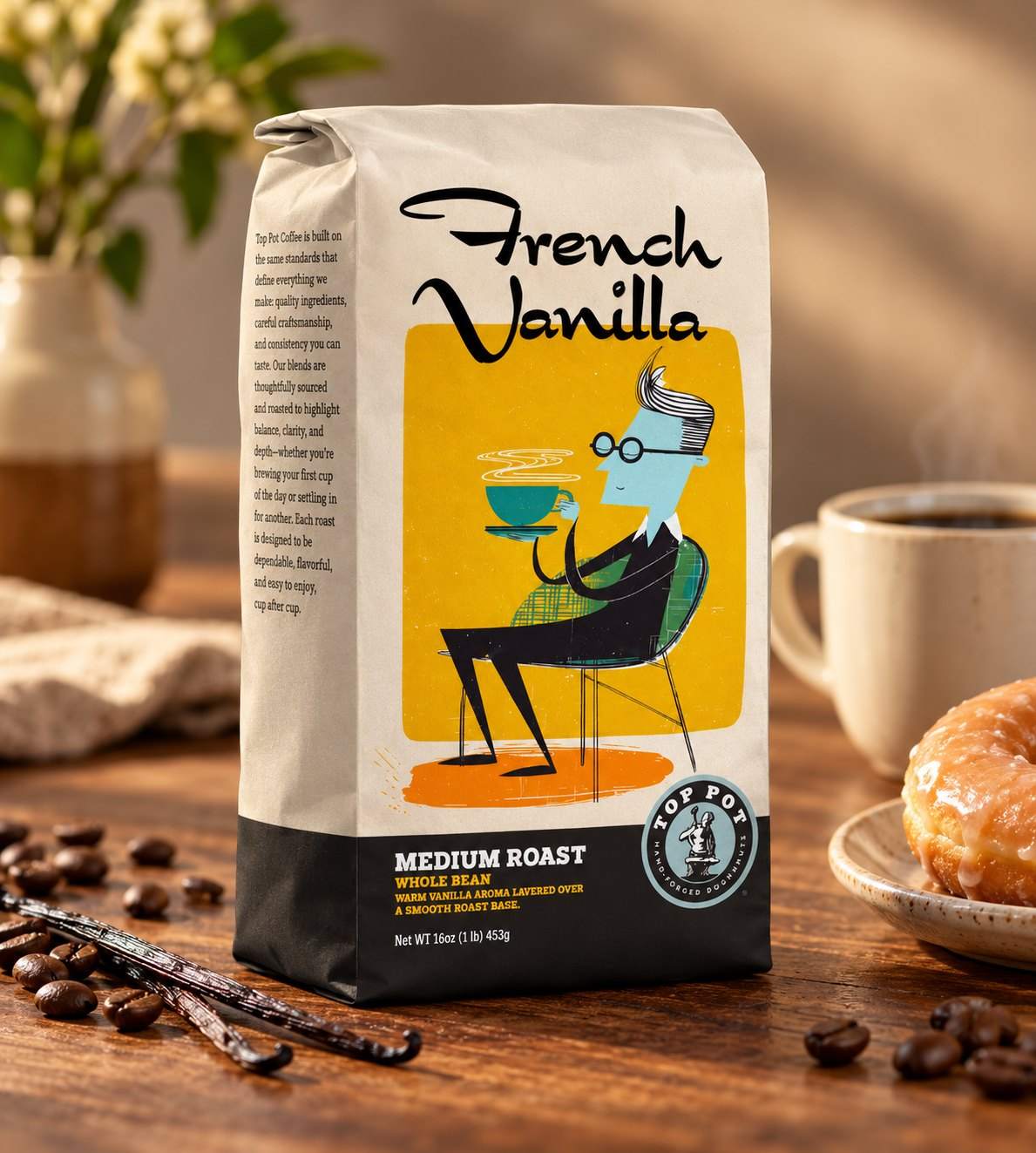
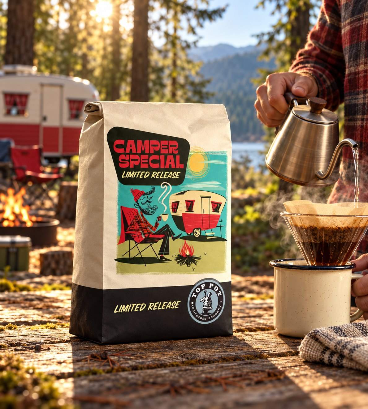
French Vanilla and a Camper Special limited release. Concept.
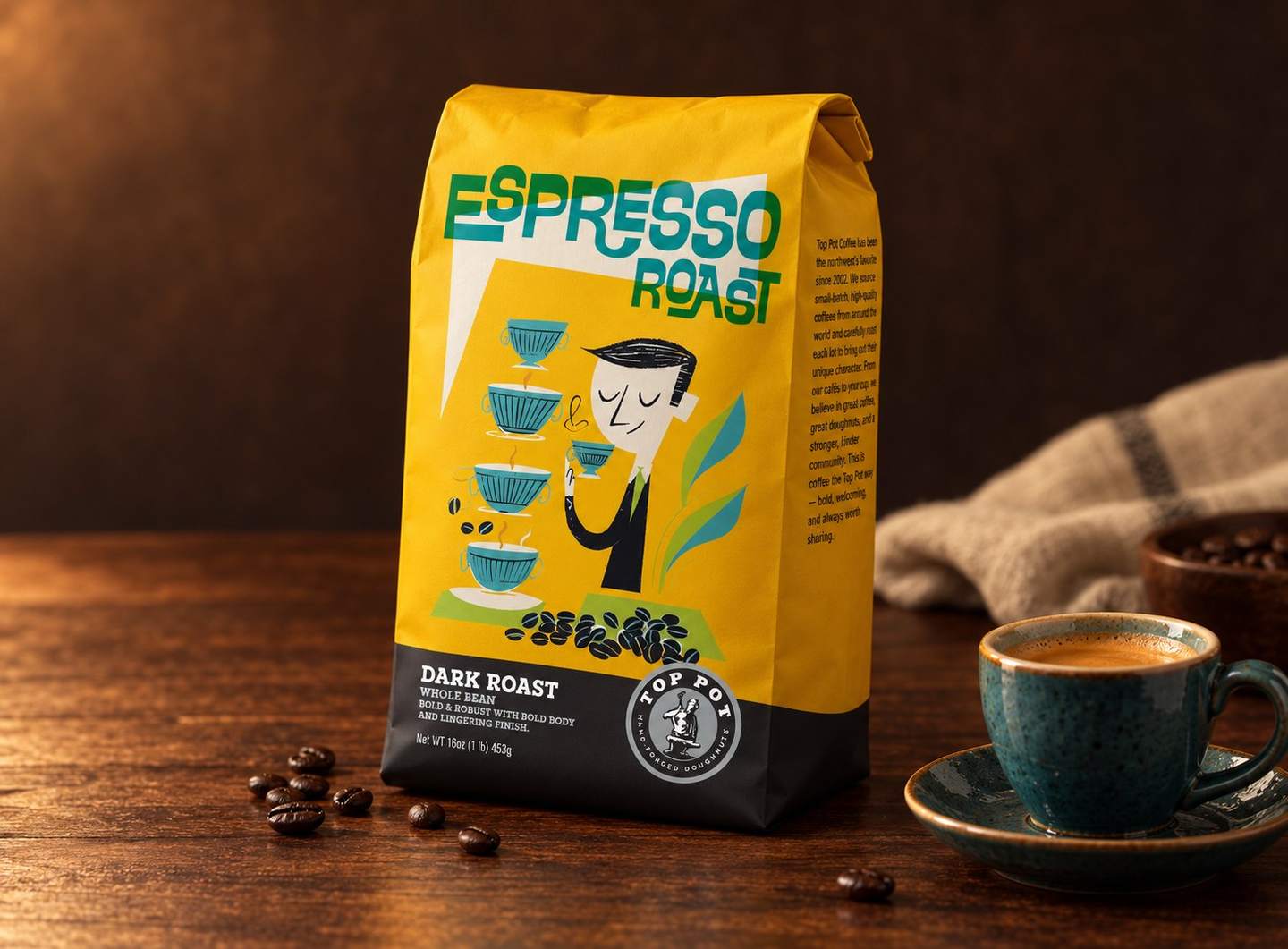
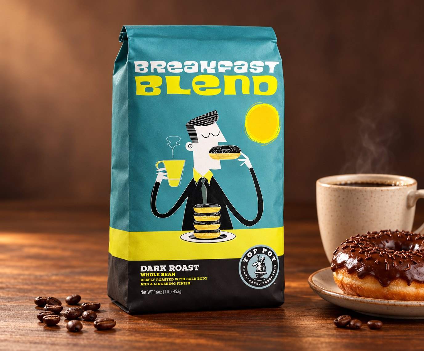
Espresso Roast and Breakfast Blend. Concept.
The outcome
A cast built to travel
9
original characters
20
year anniversary collection
17
cafes around Puget Sound
Source · Wikipedia
Launching a beverage?
One senior designer from first sketch to press,
on retainer or by the project.