Case study · Gaming & Entertainment
Tyranny of
Dragons
A franchise-wide campaign built to signal scale, conflict and rising threat across every format.
The challenge:
The campaign needed a distinct identity that could carry large scale conflict and a dragon led threat, while staying aligned with D&D's established visual language across every format.
The approach:
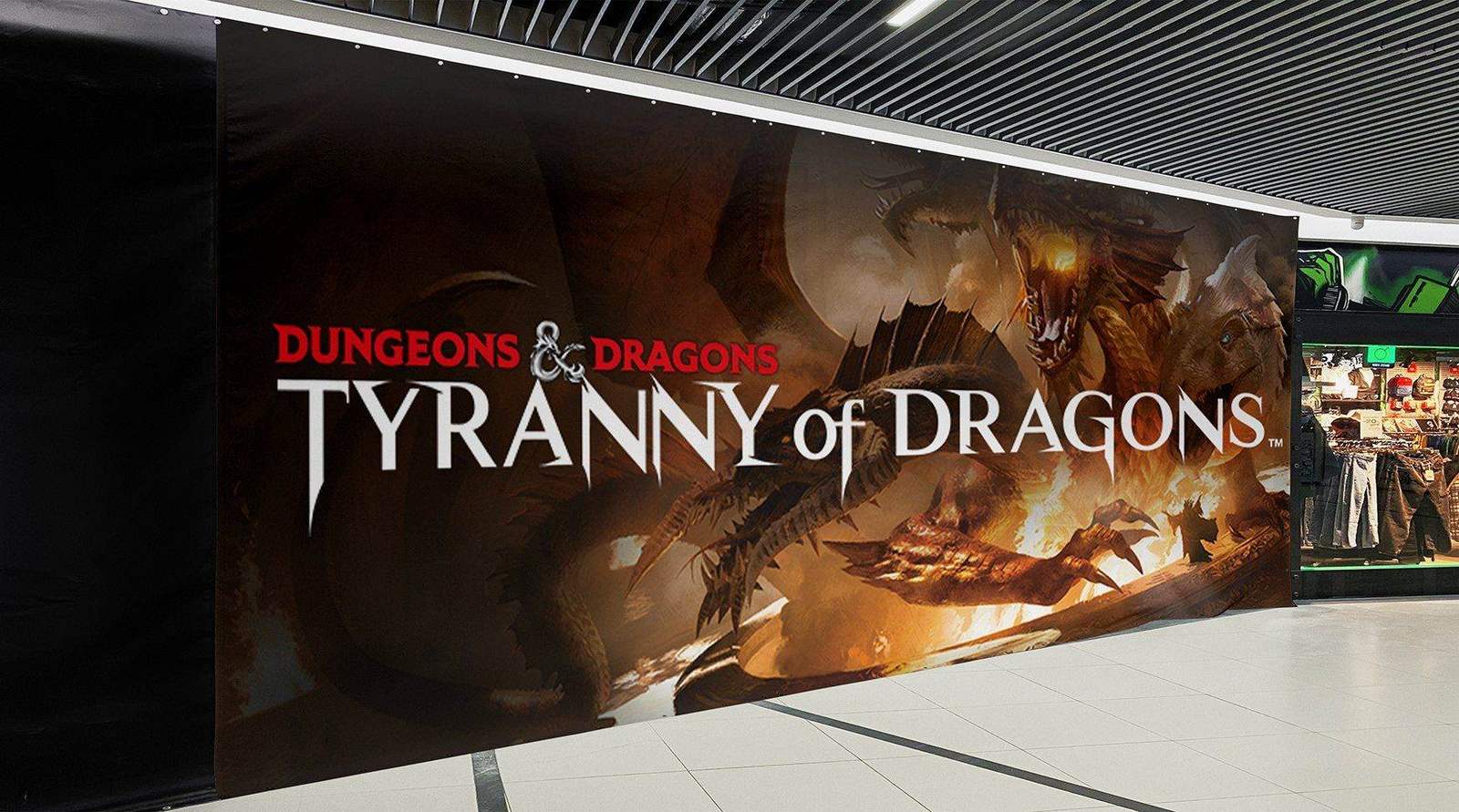
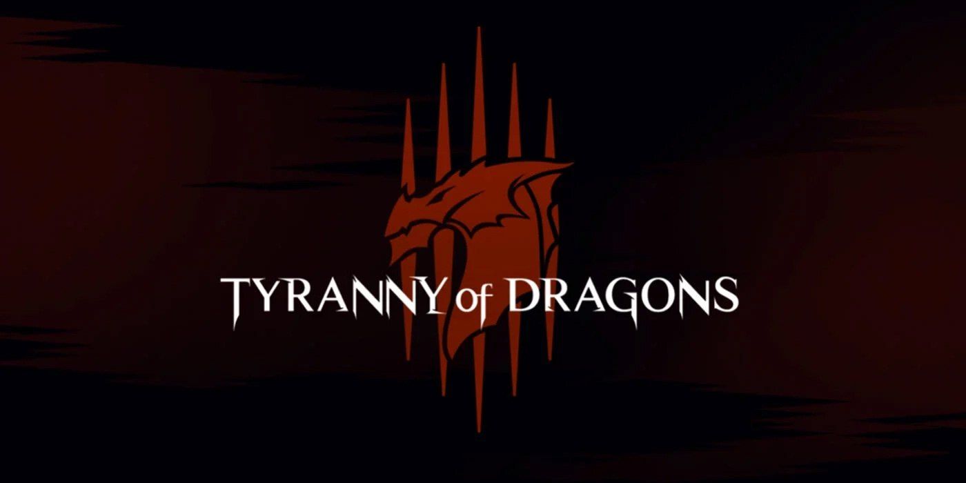
A custom logotype with a claw mark sigil that works at any size, from an in-game icon to a mall wall. Fraudster for type, with the weight to match the threat. A palette of steel, bone and deep dragon colors that holds across print, digital and product.
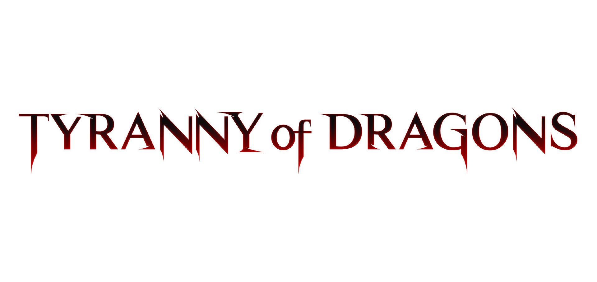
Custom campaign logoThe logotype on dark and on light.
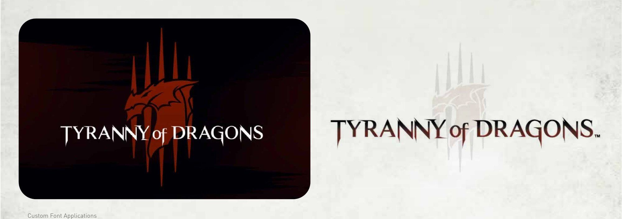
Logo and design elementsThe claw mark, from icon to lockup.
Color paletteSteel, bone and dragon colors.
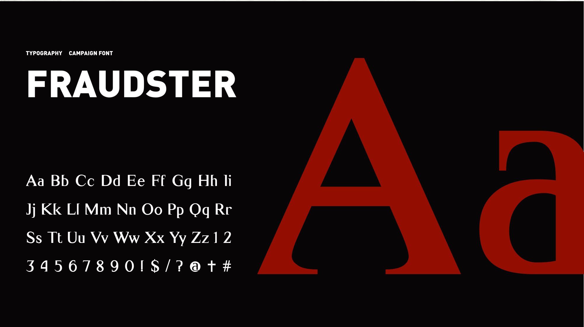
TypographyCampaign font: Fraudster.
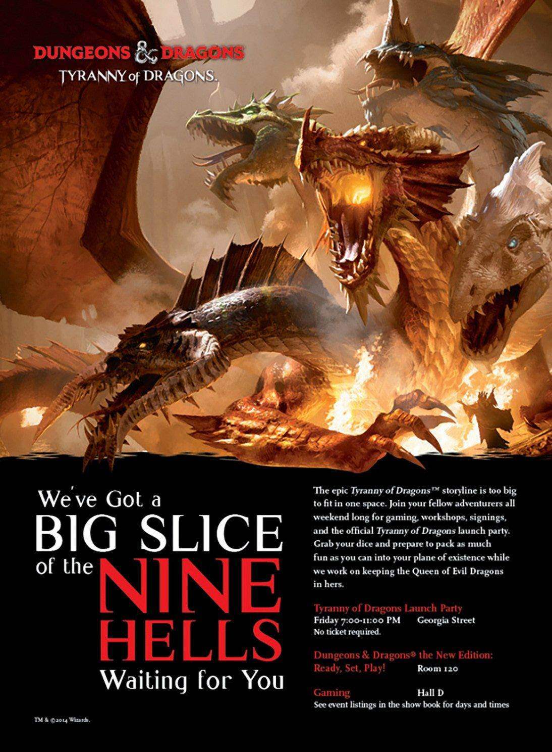
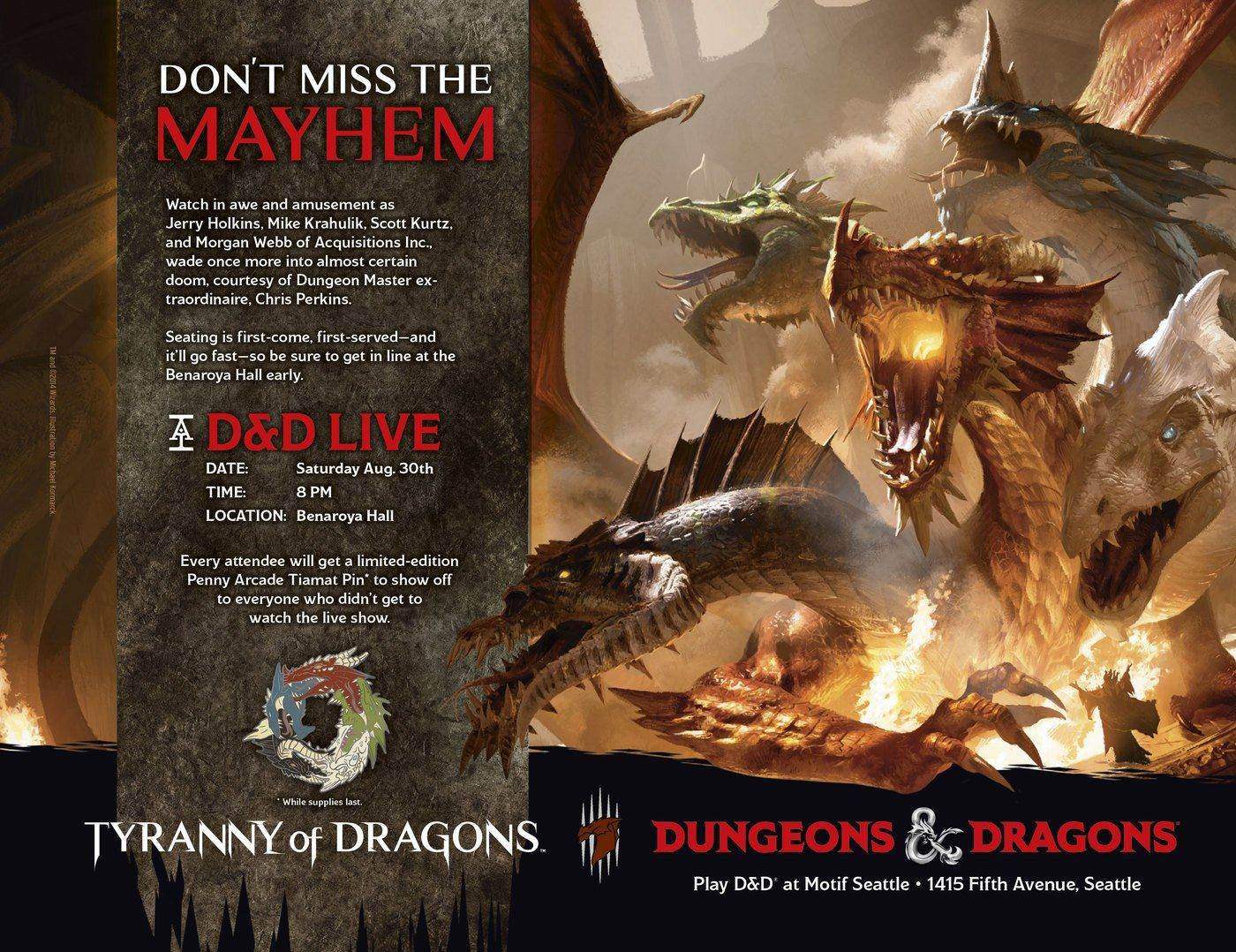
Print advertisingThe same mark across print.
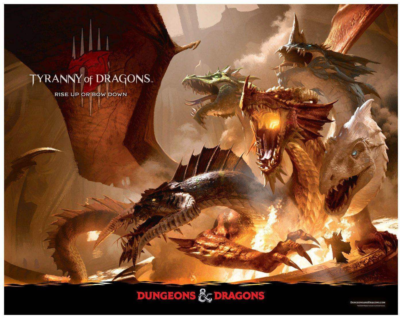
Digital promotionDragons and their allies threaten the Sword Coast.
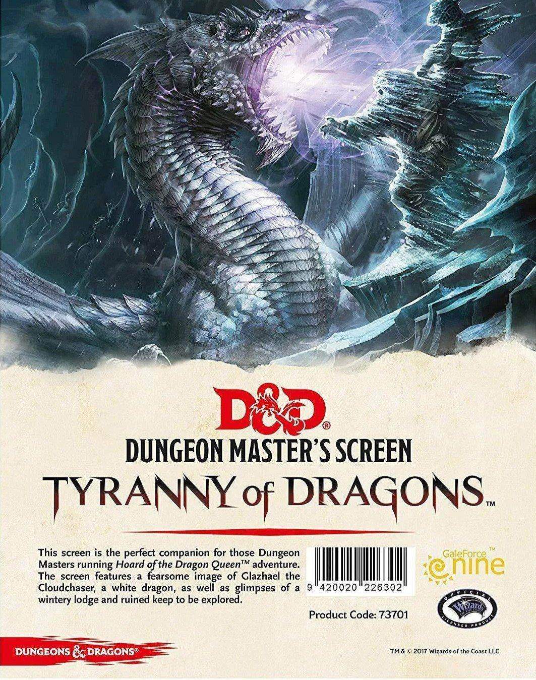
ProductThe Dungeon Master's Screen.
NeverwinterCampaign rollout to the Neverwinter MMORPG.
The outcome:
Tyranny of Dragons launched across tabletop, video games and publishing at the same time, and the visual system and logo covered all of it. Pick up any piece from any channel and you know what world you're in. And what's coming for you.
A campaign mark sharp enough to cut. Heavy enough to mean it.
Launching a set or a season?
Send the brief and the style guide.
I'll tell you on the first call what it takes.