
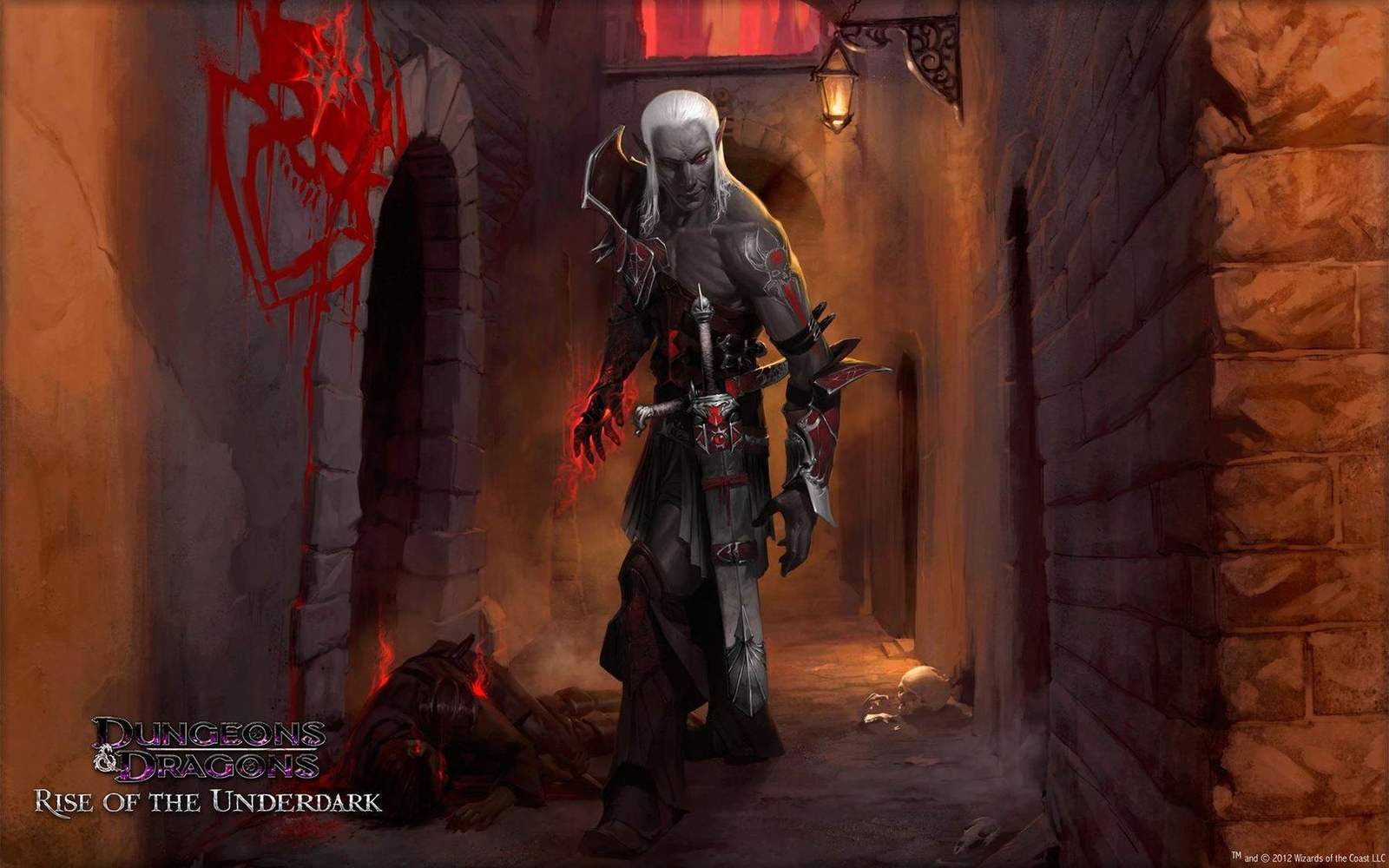
Case study · Gaming & Entertainment
Rise of the
Underdark
A visual system built around subterranean dread. Every element pulled from the world, not applied to it.
The challenge:
The Underdark is D&D's most psychologically distinct setting. Claustrophobic, ancient and threatening in a way surface campaigns rarely are. The identity needed its own tone, separate from the broader D&D campaign language, while staying recognizable as part of the franchise. A darker register, built with the same structural discipline.
The approach:
The system builds from the inside out. A palette drawn from bioluminescence and deep stone. Valdemar as the campaign typeface, carrying the weight of something ancient. And a custom set of 20+ in-game achievement icons, designed as part of one visual language across every campaign piece.
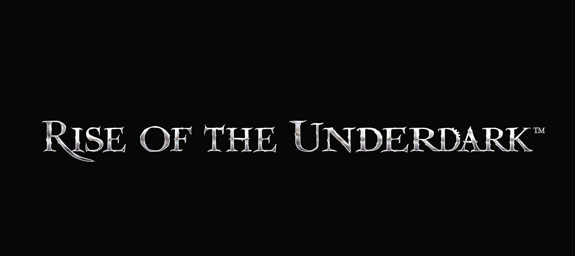
Custom campaign logoThe logotype.
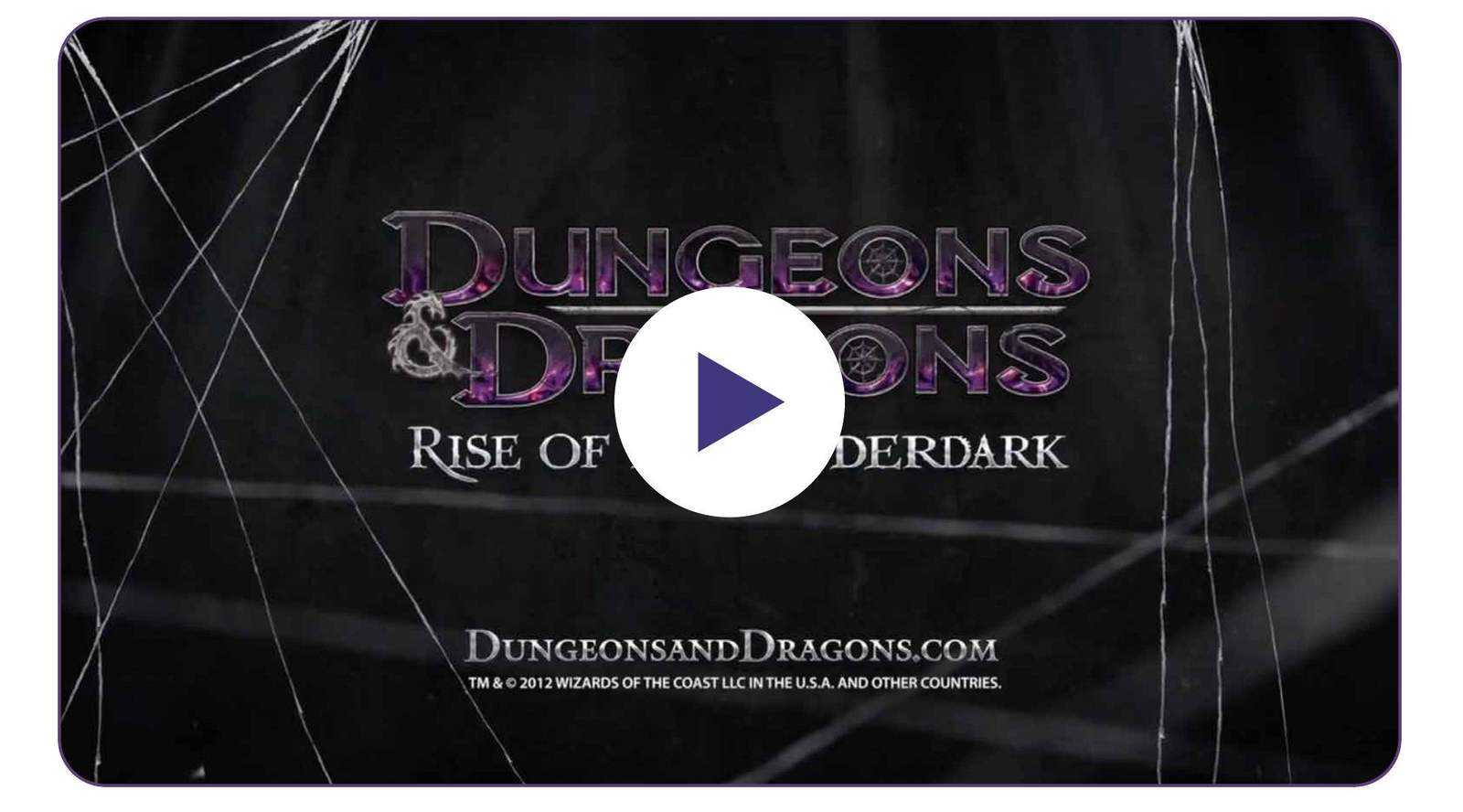
Animated campaign trailerPress play.
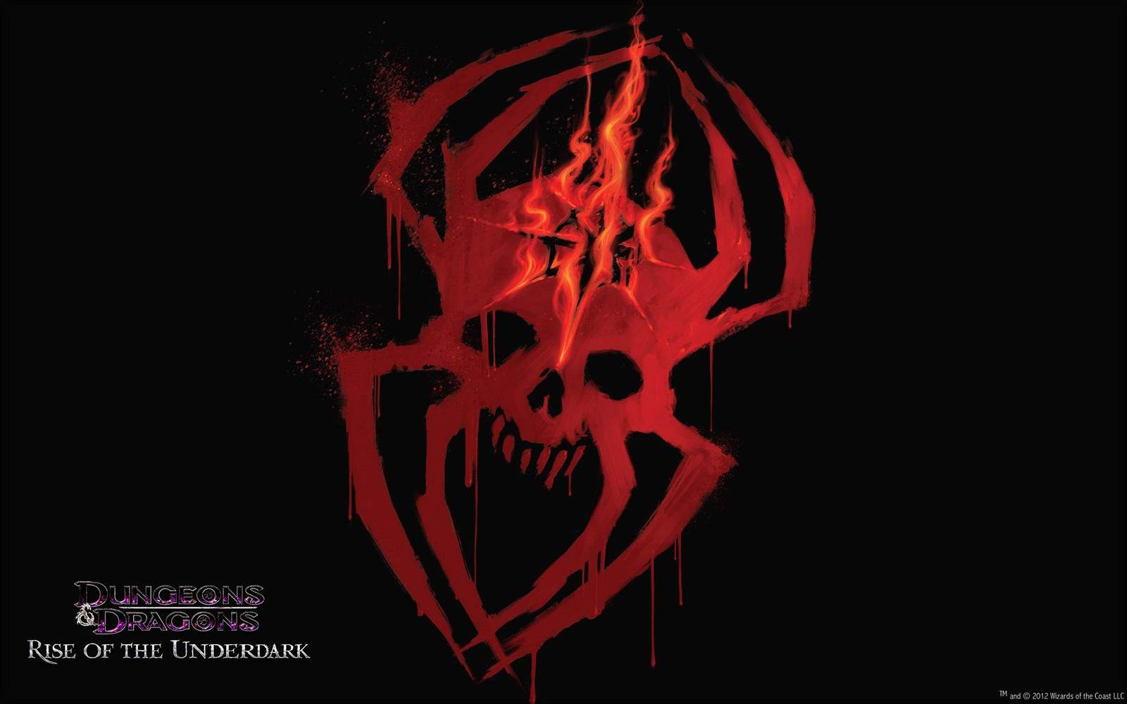
Campaign sigilThe mark that ties the campaign together.
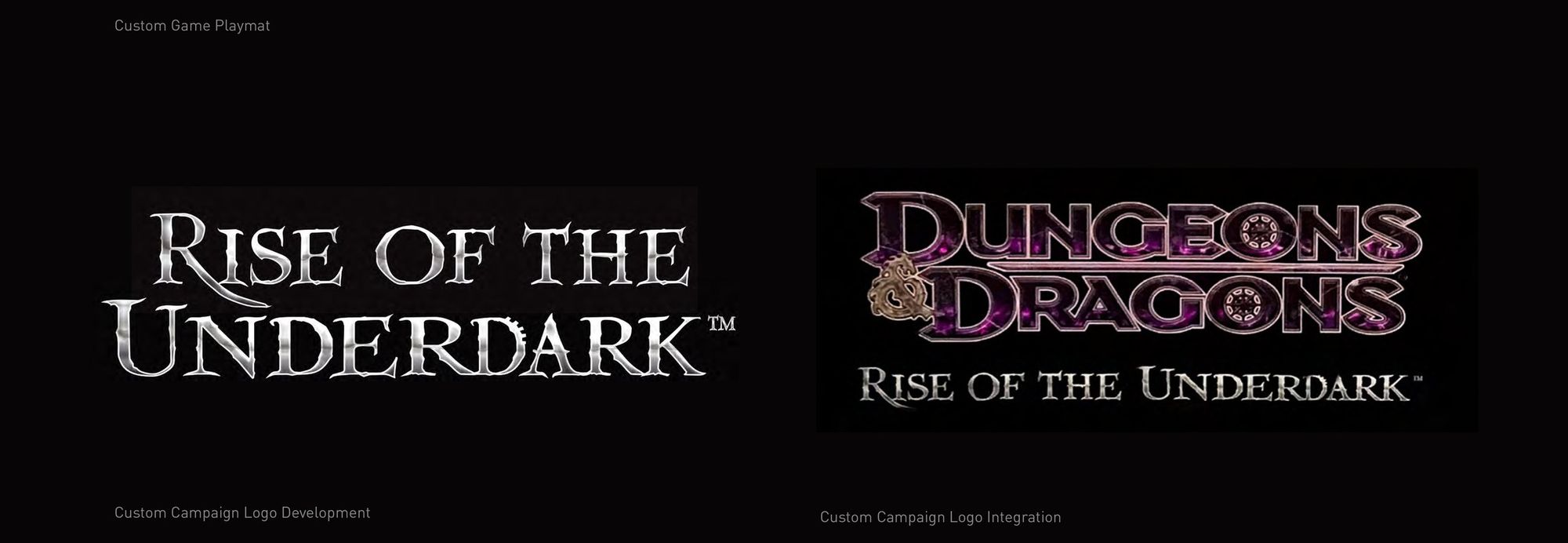
Logo integrationThe logotype on its own and with the D&D mark.

In-game icons20+ custom achievement icons.
Color paletteDrawn from bioluminescence and deep stone.
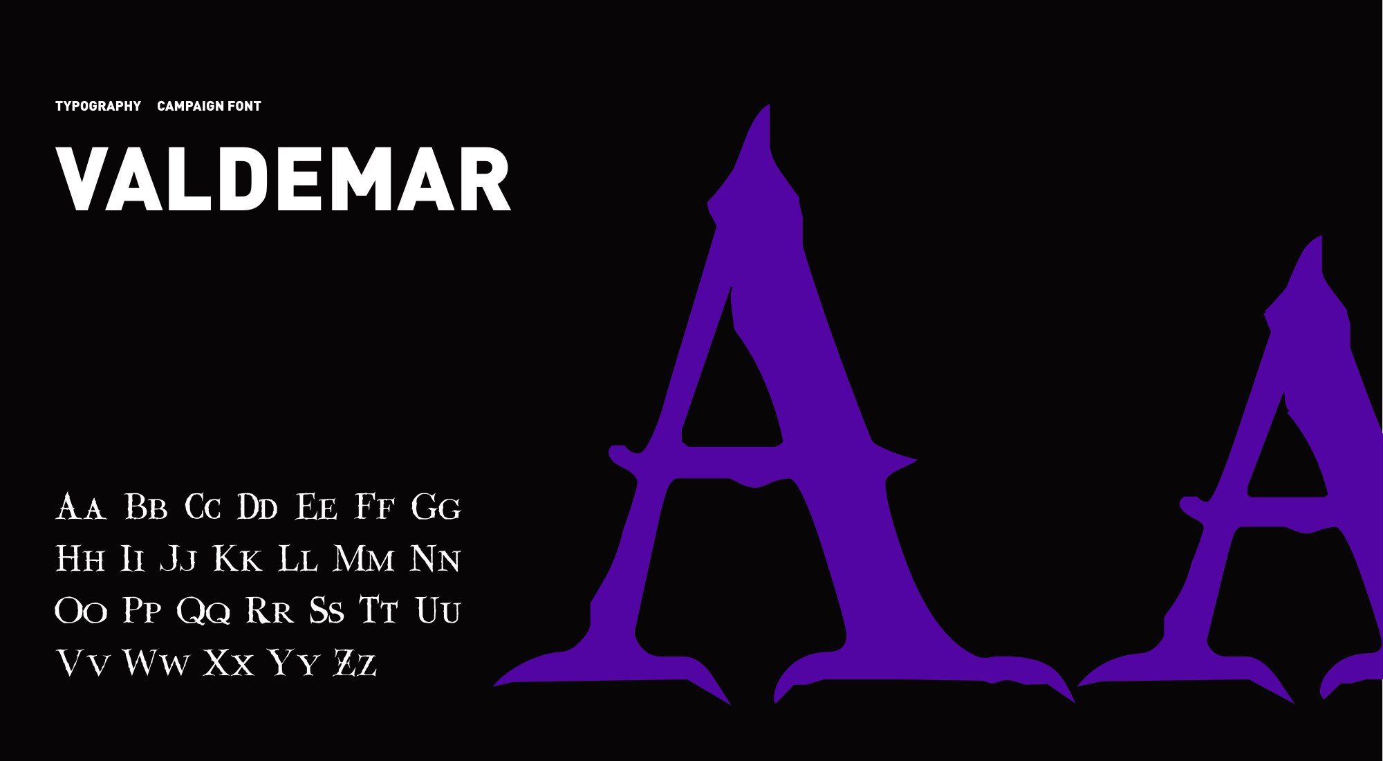
TypographyCampaign font: Valdemar.
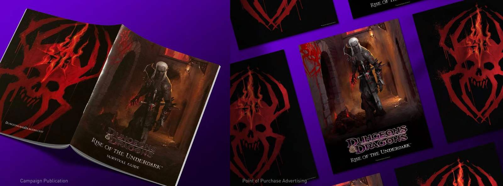
Campaign publication and playmatThe same system in players' hands.
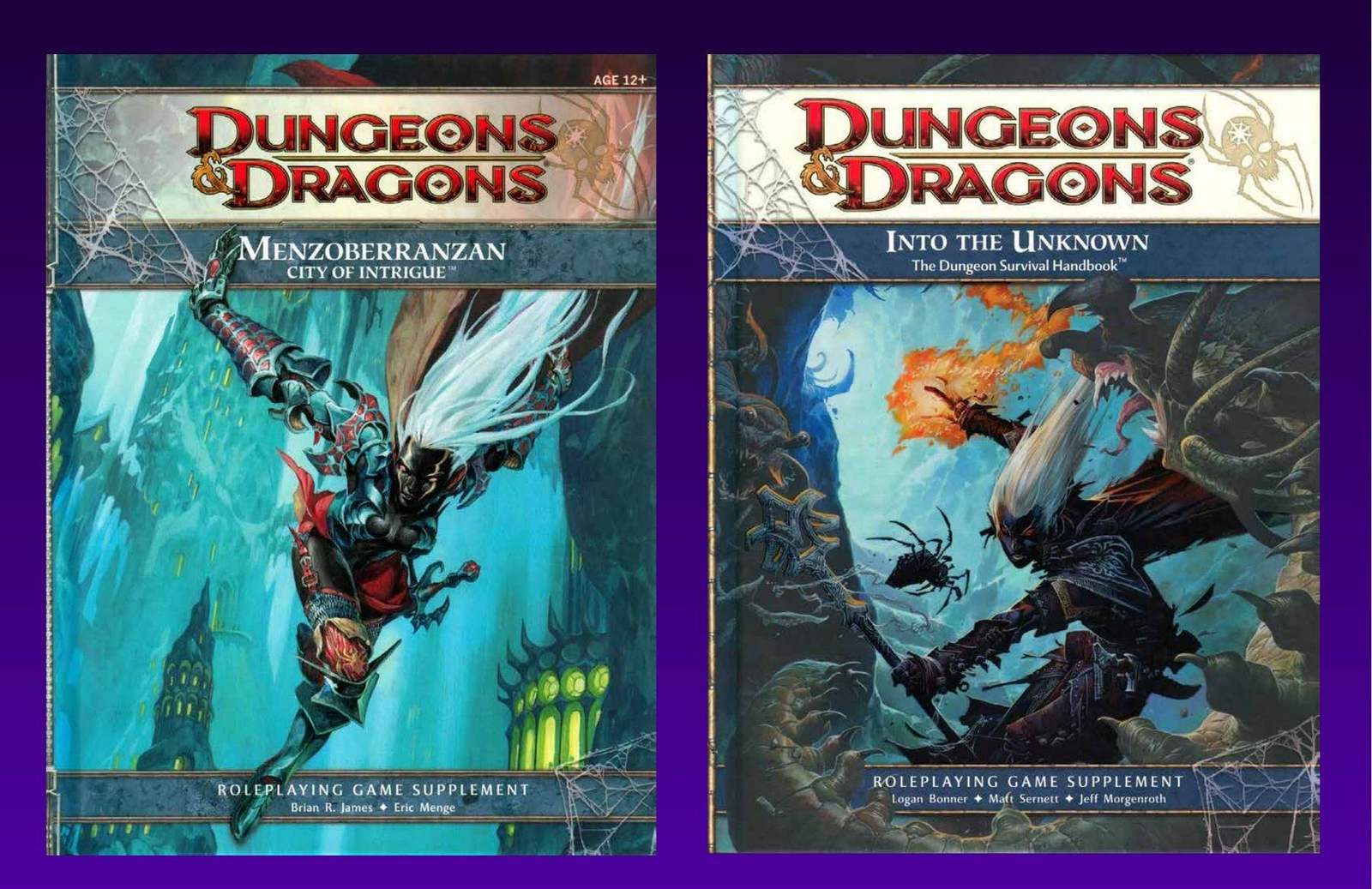
Campaign supplementsMenzoberranzan and Into the Unknown.
The outcome:
Rise of the Underdark set a visual register D&D hadn't explored at this scale. Restrained, precise and unsettling. The icon system alone gave Wizards' internal teams a language they could extend across digital, print and product for the full campaign.
Every color, every letterform, every icon pulled from the same dark place.
Launching a set or a season?
Send the brief and the style guide.
I'll tell you on the first call what it takes.