
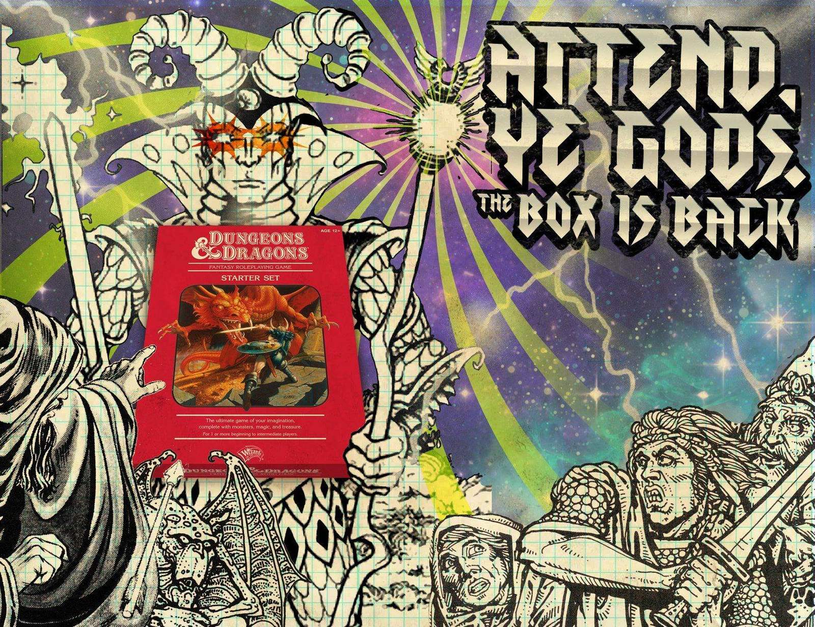
Case study · Gaming & Entertainment
Return of
the Red Box
D&D hadn't released a true beginner's box in years. This was the campaign that brought it back.
The challenge:
The Red Box is one of the most recognizable objects in gaming. Millions of people learned D&D from it, and millions more know what it is without ever opening one. That recognition is an asset and a constraint. Lean too hard on nostalgia and you lose new players. Update too much and you lose the people you want back. The campaign had to speak to both.
The approach:
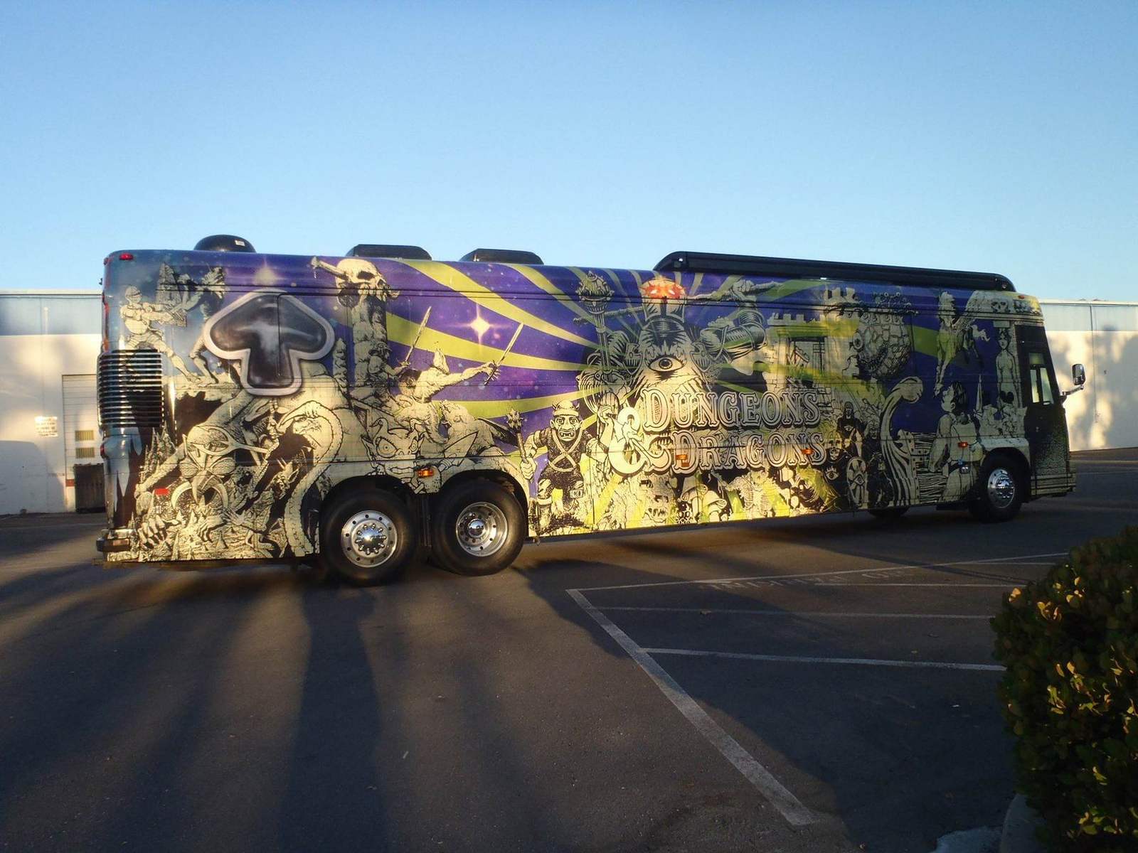
The look draws on the old school illustrators who defined the game's original world, reinterpreted for modern production. The tone is a summons, not an announcement. “Attend, Ye Gods. The Box is Back.” reads like a command performance. Concert poster energy, underground illustration craft and a typeface that feels carved into a desk. The campaign ran across social, advertising, in-store and a fully wrapped launch bus at PAX.
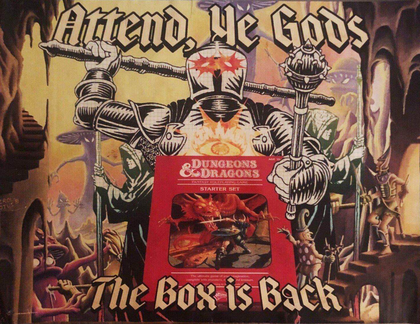
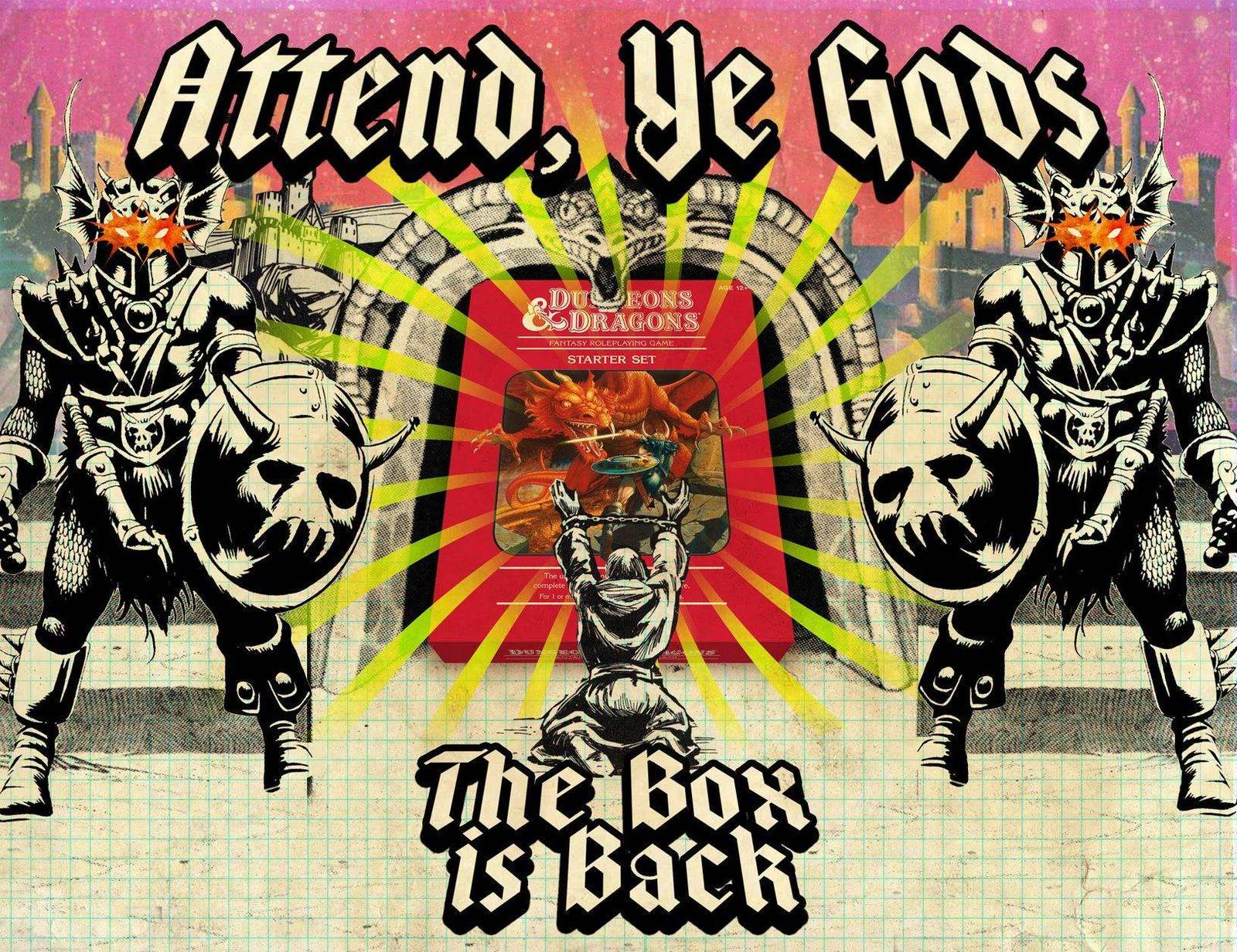
Campaign posterIt's not an ad. It's a call to arms.
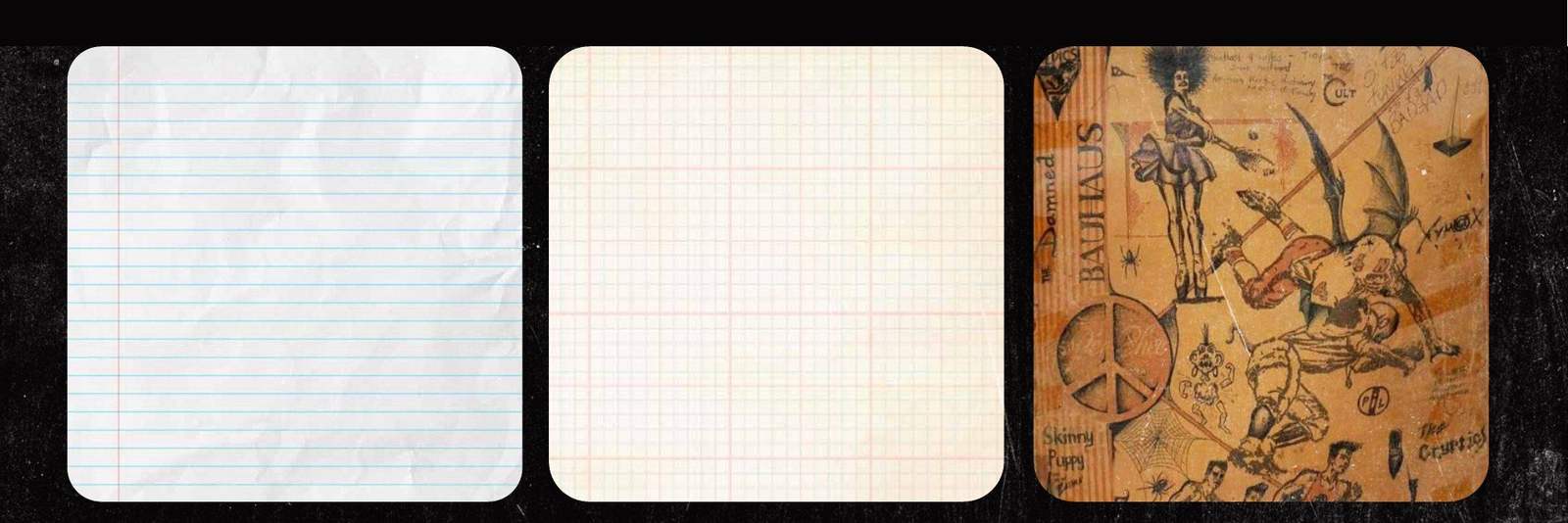
Campaign elementsStraight out of your high school notebook.
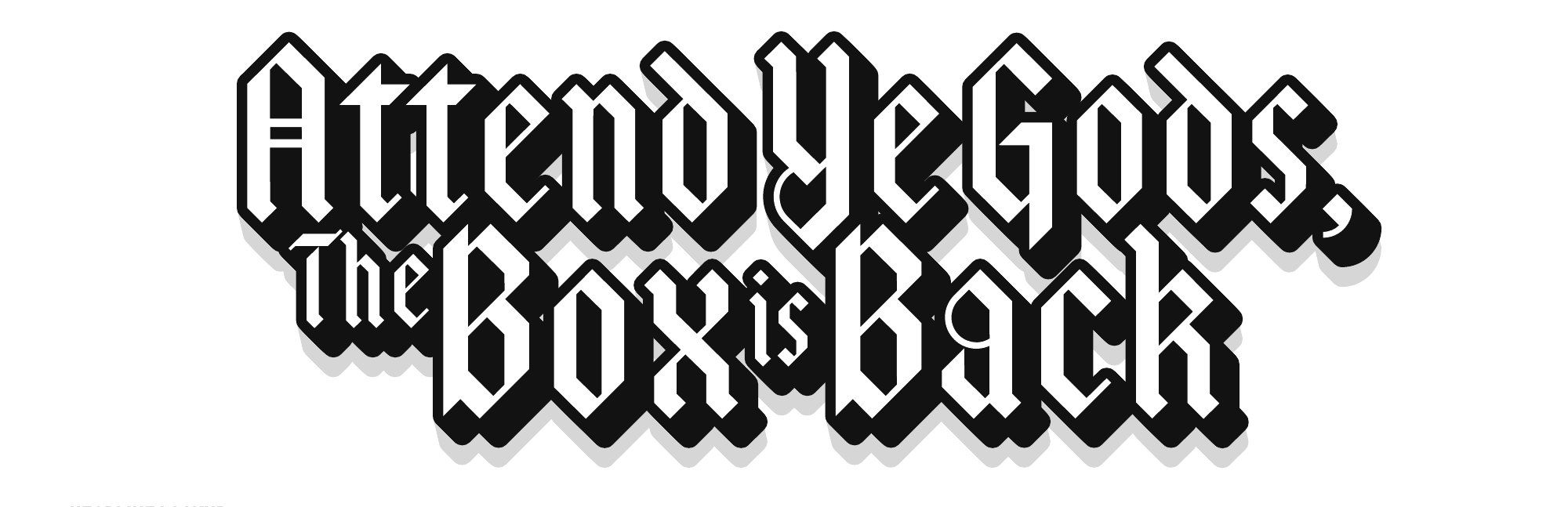
Headline lockupSimultaneously modern and throwback.
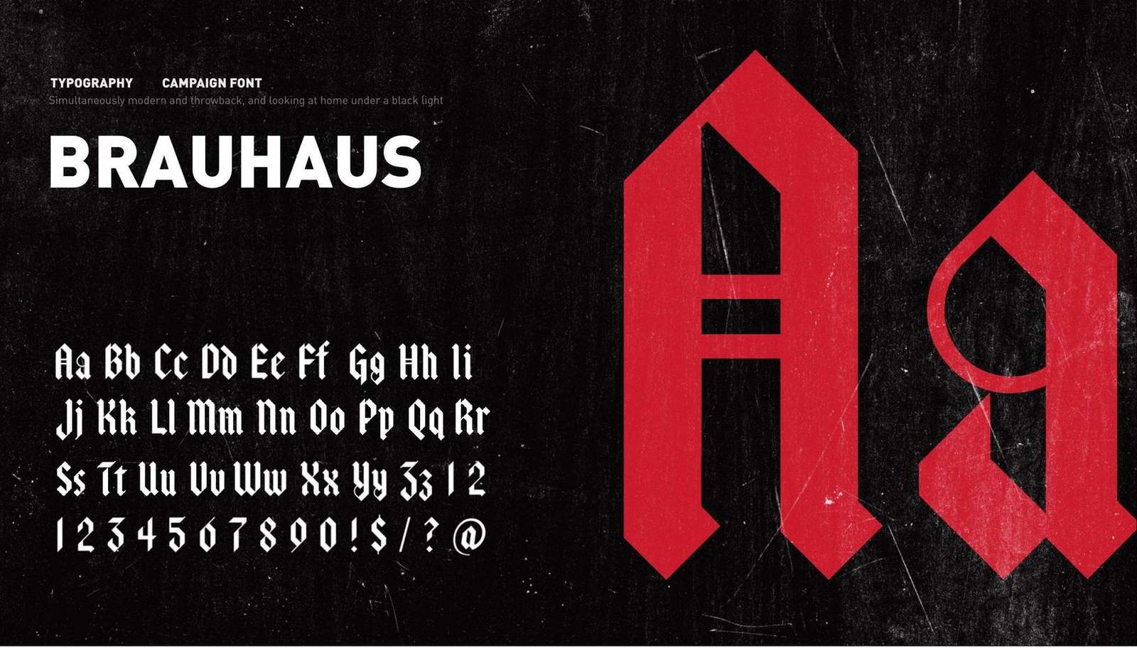
TypographyCampaign font: Brauhaus.

Color and gradient paletteControlled chaos. A psychedelic palette with strict rules about where each color lives.
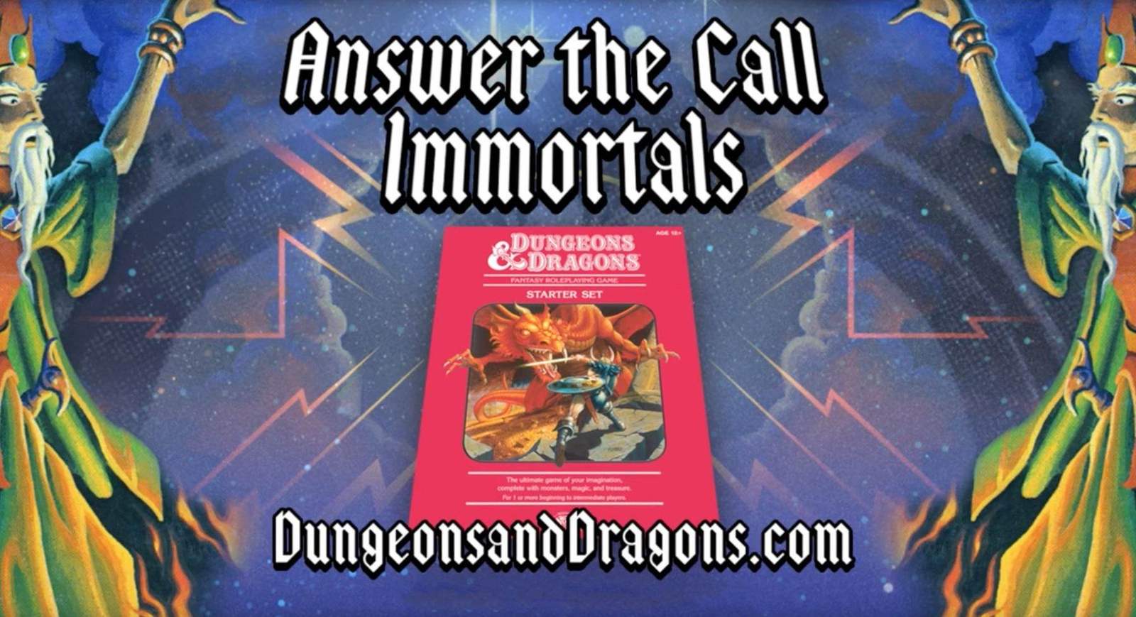
In storeRetail and online advertising from the same system.
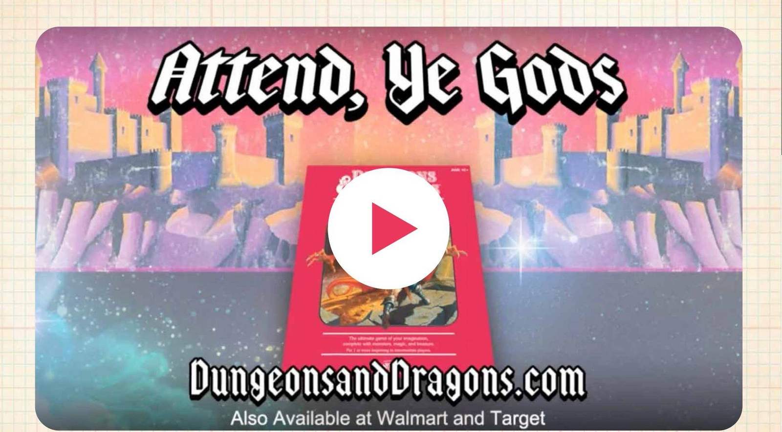
Campaign in motionAnimated spot built from the same visual system. Press play.
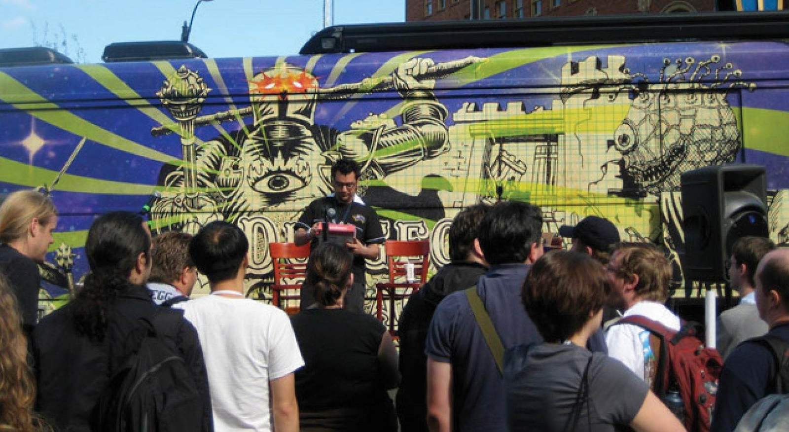
PAX tour bus45 feet of campaign.
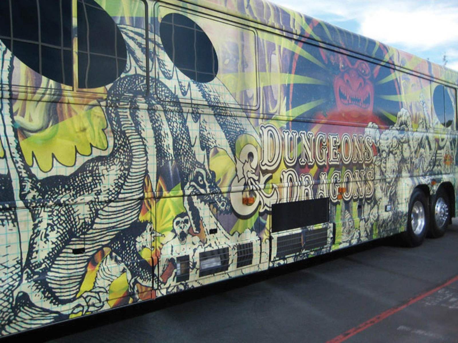
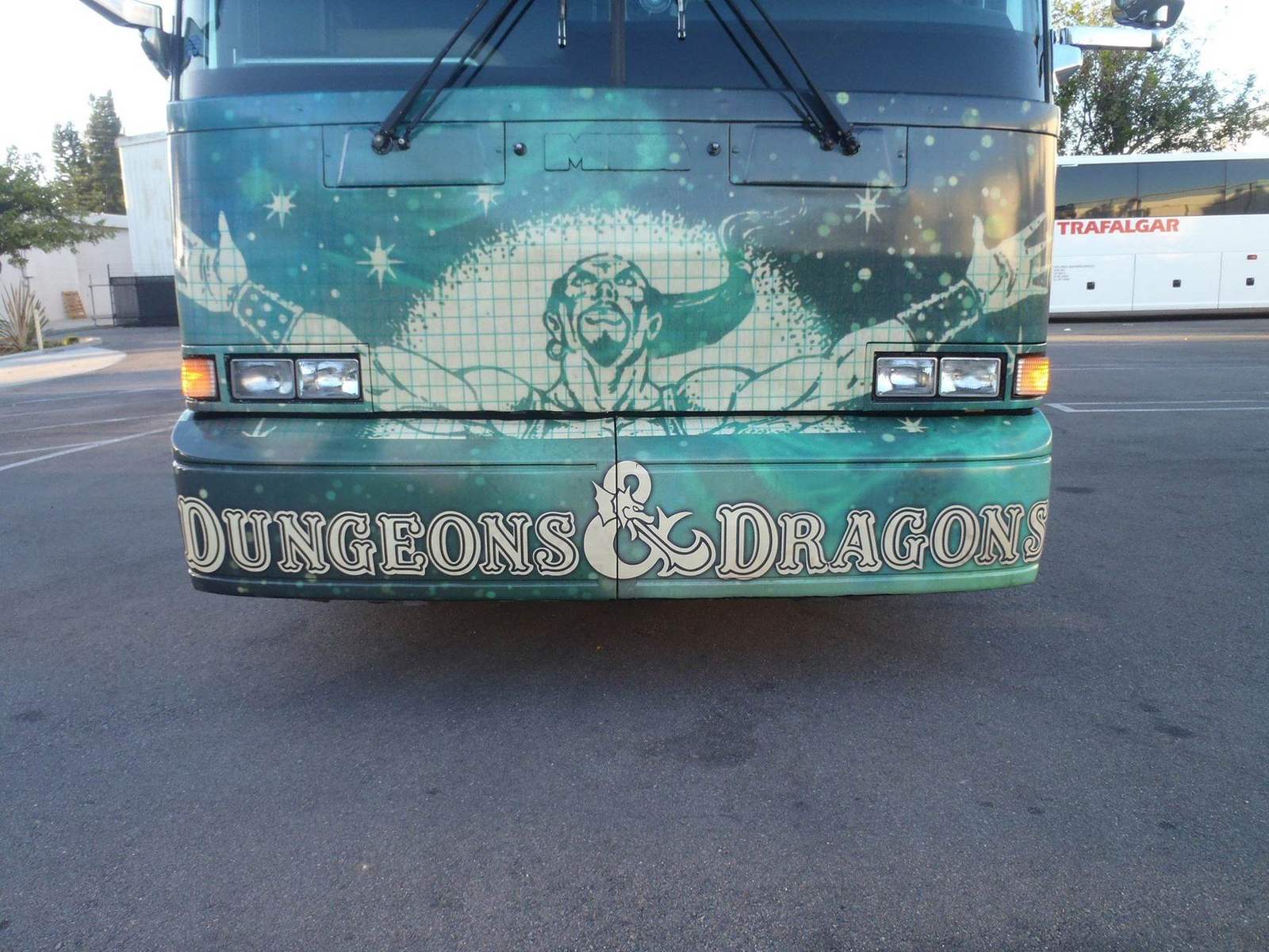
PAX tour busBuilt for large format from the start. Every detail survives the scale.
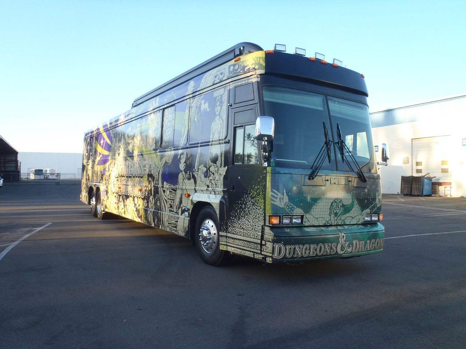
At PAXPlayers lined up at the bus.
The outcome:
A legacy product that felt current, and a little dangerous, again. The same identity ran from the box to posters, apparel, ads and a 45 foot bus that became one of the most photographed things at PAX.
Concert merch energy for a game that got its own tour.
Launching a set or a season?
Send the brief and the style guide.
I'll tell you on the first call what it takes.